


Building upon our previous analyses, we continue to monitor trends and technologies that resonate with developers and end users. Take a look at our past timeframes from our blogs.
Here are the main takeaways I see from the charts.
- Kubernetes maintains its position as the project with the largest contributor base, reflecting its continued maturity and widespread adoption.
- OpenTelemetry continues to grow its contributor base and remains the second highest velocity project in CNCF and has become the “kubernetes” of the o11y world.
- Backstage addresses developer experience pain points and has become the most popular open source IdP in the world.
- GitOps remains integral to the cloud native ecosystem, with projects like Argo and Flux cultivating large communities.
- Crossplane has seen a contributor base growth of over 20% in the last year, highlighting the demand for open source control planes and multi cloud management.
- Kubeflow has entered the top 30 CNCF project list, underscoring the role of CNCF projects in underpinning large-scale AI infrastructure.
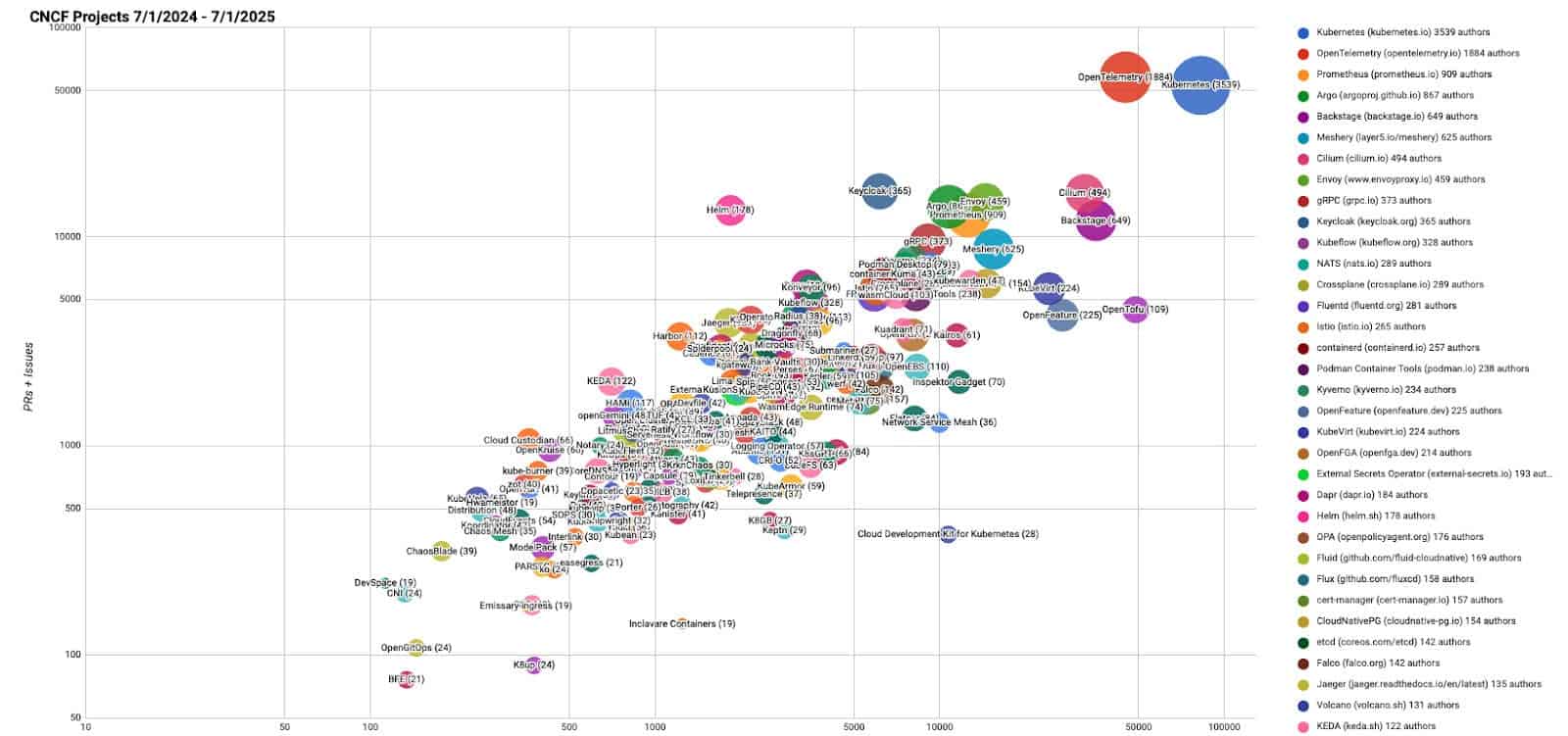
NOTE: We use bubble charts to show three axes of data: commits, authors, and comments/pull requests, and plot on a log-log chart to show the data across large scales.
- The bubble’s area is proportional to the number of authors
- The y-axis is the total number of pull requests and issues
- The x-axis is the number of commits
All of the current and past reports are available on GitHub.
All of the scripts used to generate this data are at https://github.com/cncf/velocity (under an Apache 2.0 license). If you see any errors, please open an issue there.
Past blog posts about project velocity:
- 2024 year in review of CNCF and top 30 open source project velocity
- wasmCloud on the factory floor: efficient and secure processing of high velocity machine data
- As we reach mid-year 2024, a look at CNCF, Linux Foundation, and top 30 open source project velocity
- A look back at CNCF, Linux Foundation, and top 30 open source project velocity in 2023
- October 2023: where we are with velocity of CNCF, LF, and top 30 open source projects
- A look at the 2022 velocity of CNCF, Linux Foundation, and top 30 open source projects
- Mid-year update on 2022 CNCF, Linux Foundation, and open source velocity
- End of year update on CNCF and open source velocity in 2021
- Update on CNCF and Open Source Project Velocity 2020
- The 30 highest velocity open source projects