By Chris Aniszczyk
Consistently looking into CNCF and Linux Foundation project’s velocity and the 30 top open source projects give us a very good indication of trends that are resonating with developers and end users. As a result, we can get insight into platforms that will likely be successful.
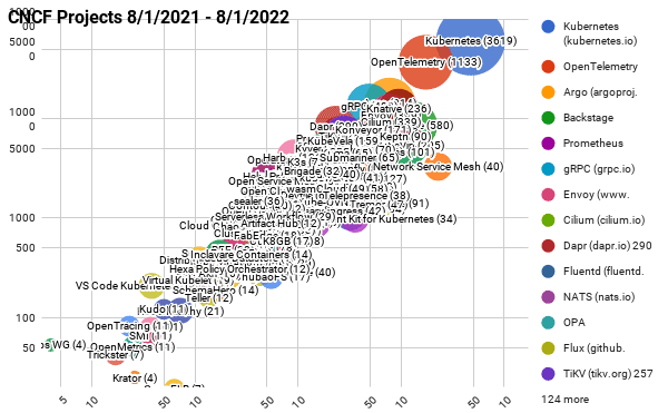
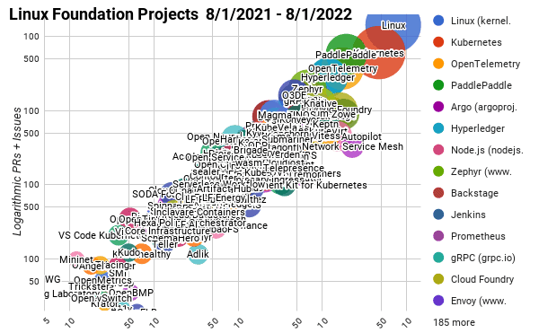
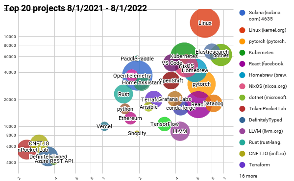
We use bubble charts to show three axes of data: commits, authors, and comments/pull requests, and plot on a log-log chart to show the data across large scales.
- The bubble’s area is proportional to the number of authors
- The y-axis is the total number of pull requests and issues
- The x-axis is the number of commits
Here are the main takeaways I see from these charts:
- Kubernetes continues to mature and have the largest contributor base
- OpenTelemetry continues to grow its contributor base and has become the second highest velocity project in the CNCF ecosystem
- Backstage a year ago barely made this list and continues to grow, solving an important pain point around cloud native developer experience
- GitOps continues to be an important technique in the cloud native ecosystem where projects like Argo and Flux continue to cultivate large communities
CNCF projects – Last 12 months (interactive map)
Linux Foundation Projects – Last 12 months (interactive map)
Top 30 open source projects – Last 12 months (interactive map)
You can find all the current and past reports on GitHub, as well as a list and charts on the Google sheets below:
- All CNCF projects in the last 12 months
- All Linux Foundation projects in the last 12 months
- Top 30 open source projects in the last 12 months
All of the scripts used to generate this data are at https://github.com/cncf/velocity (under an Apache 2.0 license). If you see any errors, please open an issue there.
Past blog posts about project velocity: