


By Chris Aniszczyk
We have been tracking open source project velocity over the last several years and wanted to share the latest update highlighting open source project velocity over the last 12 months. With these charts, we can keep track of the trends and technologies that are resonating with developers and end users. For comparison, have a look at the insights from 2022.
Here are the main takeaways I see from these charts:
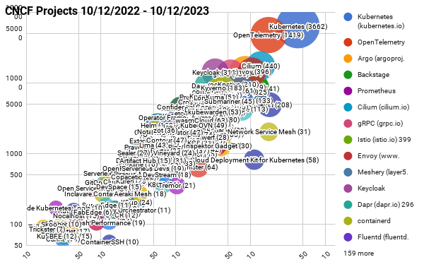
- Kubernetes continues to mature with the largest contributor base
- OpenTelemetry continues to grow its contributor base and remains the second highest velocity project in the CNCF ecosystem
- Backstage continues to grow, solving an important pain point around cloud native developer experience
- GitOps continues to be important in the cloud native ecosystem, where projects like Argo and Flux continue to cultivate large communities.
- The importance of cost management in tight economic times has resulted in OpenCost appearing in the top 30 CNCF project list for the first time. I expect to see OpenCost continue to grow along with the rise of the FinOps movement worldwide.
- As Kubernetes matures, many organizations turn to service mesh technology and those projects in CNCF like Envoy, Cilium, and Istio continue to cultivate large contributor communities to meet the demand. Cilium recently graduated inside of CNCF and moved up a couple spots in the top 30 CNCF project list.
- In many cases, CNCF projects underpin large scale AI infrastructure and we have Kubeflow appearing on the top 30 CNCF project list for the first time.
CNCF projects – Last 12 months (interactive map)
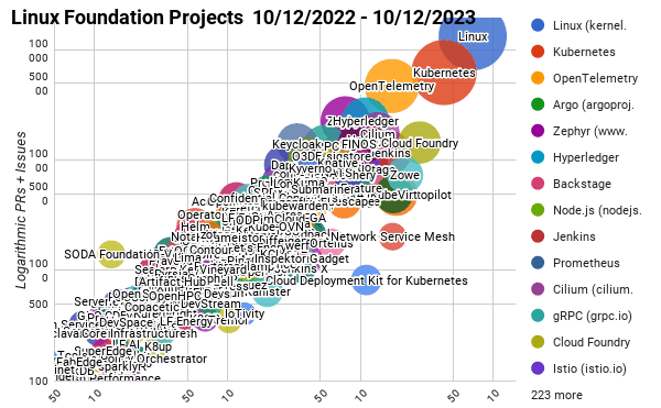
Linux Foundation Projects – Last 12 months (interactive map)
Top 30 open source projects – Last 12 months (interactive map)
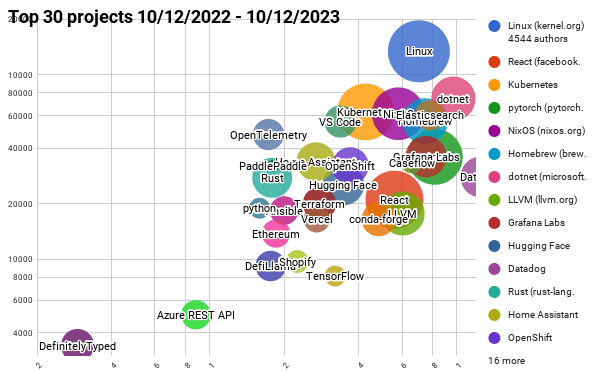
NOTE: We use bubble charts to show three axes of data: commits, authors, and comments/pull requests, and plot on a log-log chart to show the data across large scales.
- The bubble’s area is proportional to the number of authors
- The y-axis is the total number of pull requests and issues
- The x-axis is the number of commits
All of the the current and past reports are available on GitHub, as well as a list and charts on the Google sheets below:
- All CNCF projects for Oct 2022 – Oct 2023
- All Linux Foundation projects for Oct 2022 – Oct 2023
- Top 30 open source projects for Oct 2022 – Oct 2023
All of the scripts used to generate this data are at https://github.com/cncf/velocity (under an Apache 2.0 license). If you see any errors, please open an issue there.
Past blog posts about project velocity:
- A look at the 2022 velocity of CNCF, Linux Foundation, and top 30 open source projects
- Mid-year update on 2022 CNCF, Linux Foundation, and open source velocity
- End of year update on CNCF and open source velocity in 2021
- Update on CNCF and Open Source Project Velocity 2020
- The 30 highest velocity open source projects