

In line with our goal of providing velocity updates every six months or so, below are the charts showing open source project velocity over 2022. Thanks to the insights we can glean from these charts, we are able to keep track of the trends and technologies that are resonating with developers and end users.
Here are the main takeaways I see from these charts:
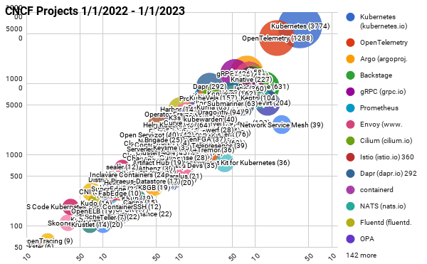
- Kubernetes continues to mature and have the largest contributor base
- OpenTelemetry continues to grow its contributor base and has become the second highest velocity project in the CNCF ecosystem.
- Backstage a year ago barely made this list and continues to grow, solving an important pain point around cloud native developer experience. Backstage moved to incubation in 2022 and will continue to cultivate the developer portal ecosystem.
- GitOps continues to be an important technique in the cloud native ecosystem where projects like Argo and Flux continue to cultivate large communities and have recently both graduated in CNCF.
- As Kubernetes matures, many organizations turn to service mesh technology and those projects in CNCF like Envoy, Cilium, and Istio continue to cultivate large contributor communities to meet the demand.
CNCF projects – Last 12 months (interactive map)
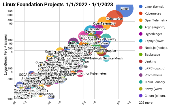
Linux Foundation Projects – Last 12 months (interactive map)
Top 30 open source projects – Last 12 months (interactive map)
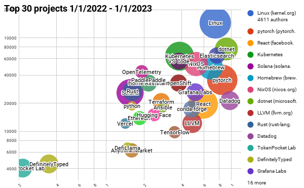
NOTE: We use bubble charts to show three axes of data: commits, authors, and comments/pull requests, and plot on a log-log chart to show the data across large scales.
- The bubble’s area is proportional to the number of authors
- The y-axis is the total number of pull requests and issues
- The x-axis is the number of commits
All of the the current and past reports are available on GitHub, as well as a list and charts on the Google sheets below:
- All CNCF projects for 2022
- All Linux Foundation projects for 2022
- Top 30 open source projects for 2022
All of the scripts used to generate this data are at https://github.com/cncf/velocity (under an Apache 2.0 license). If you see any errors, please open an issue there.
Past blog posts about project velocity: