
KCD post by the KCD Italy Team
The Call for Harmonization
The Kubernetes Community Days (KCD) Italy, a vibrant event supported by the CNCF, is back with a fresh twist. In 2024, the CNCF and the Linux Foundation required an effort to harmonize all KCDs logos globally. This is an article meant to tell about the results of how this challenging process led to a harmonious blend of tradition and global alignment. Let’s explore the reasons behind this transformation, the logo’s history, and why maintaining a consistent brand identity remains paramount. KCD Italy is one among many, just an example (and because we, the team, love its history).
The original Logo
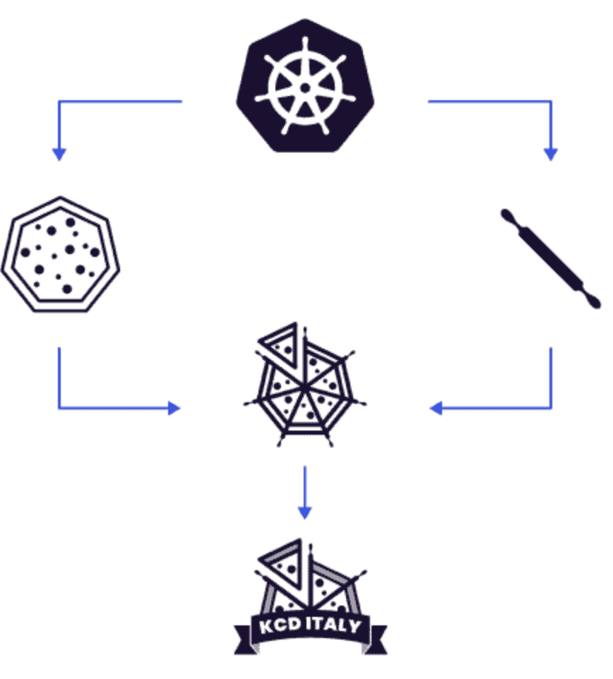
The KCD Italy logo has always been a symbol of community spirit, collaboration, and passion for Kubernetes. In 2021, the logo featured a playful half-pizza slice nestled between rolling pins, reminiscent of steering arms on a Kubernetes rudder. This whimsical design captured the essence of KCD Italy: a community that comes together like ingredients in a delicious pizza, creating something greater than the sum of its parts.
Why the Change?
The previous KCD Italy logo served us well, but as the community expanded, so did the global Kubernetes Community Days Program. The CNCF, in collaboration with the Linux Foundation, encouraged us to align our visual identity with other KCD events worldwide. It was time to evolve—to create a logo that resonated both locally and globally.
The Story Behind the Elements
Amid countless discussions and brainstorming sessions, the answer emerged: the pizza. What could be more Italian than this beloved dish? Pizza embodies the essence of Italy, exported worldwide, it symbolizes sociability, sharing, and simplicity. It bridges the North, Center, and South of the peninsula, uniting Italians over a common love for its cheesy, doughy goodness.
But this wasn’t just any pizza. KCD Italy’s logo features a sliced half-pizza nestled between rolling pins. These rolling pins evoke the steering arms of a Kubernetes rudder, emphasizing the passion that drives the Cloud Native community. It’s a playful nod to the tech world, where work and enthusiasm often intertwine.
Let’s dissect the logo once more:
- Pizza: A nod to the global community. Its toppings – representing different cultures, languages, and perspectives – blend seamlessly.
- Slice: Our heritage. Because we aim to share with the community.
- Rolling Pins: Steering us toward shared goals. Kubernetes, like a well-kneaded dough, binds us together.
- Festoon: A touch of whimsy and celebration, emphasizing the student spirit of learning and growth.
- Anchors: A nod to nautical references in Cloud Native – anchors keep us grounded as we sail through the digital seas.
- Tomato Red: Bold and vibrant, it signifies our passion for open source.
- Light Dough Color: A reminder that our journey is both unique and nourishing.
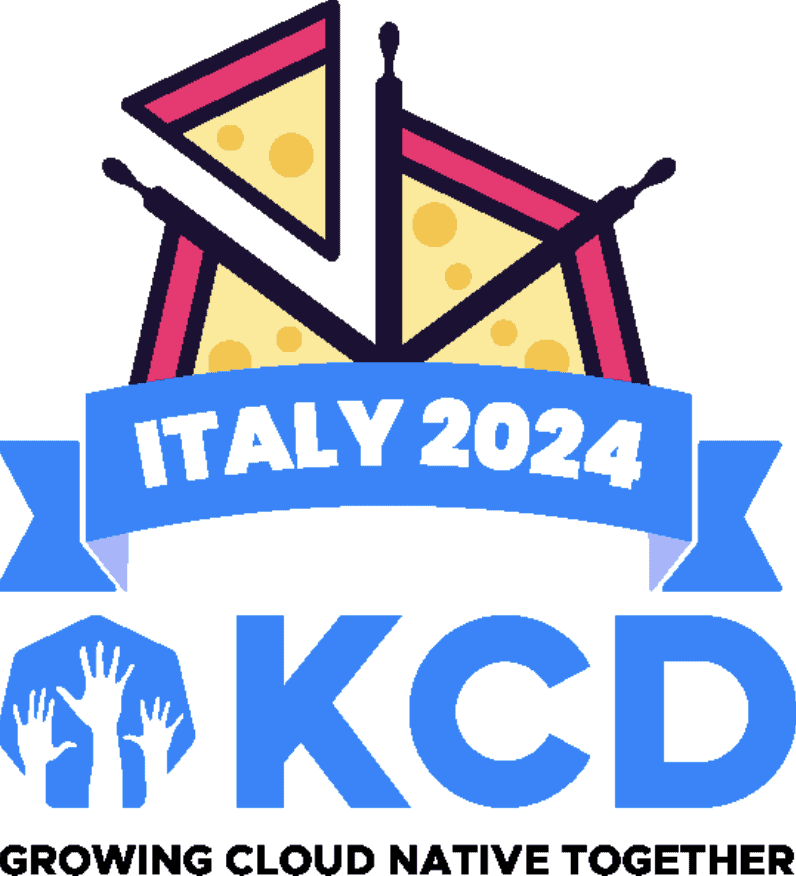
KCD Programme’s Logo: Colors and Symbolism
The Kubernetes Community Days (KCDs) logo is a visual representation that encapsulates the essence of this community-driven event. Let’s break down its elements:
- Color Palette:
- The logo predominantly features shades of blue and white. Blue symbolizes trust, stability, and technology, which aligns with Kubernetes’ core principles.
- The white background signifies openness, transparency, and collaboration.
- Iconography:
- The hands in the logo communicate community collaboration, knowledge sharing, and technological advancement.
- It invites participants to come together, learn, and contribute to the Kubernetes ecosystem, recalled by the hexagon of the background.
- Pay-off:
- Growing Cloud Native together: it’s clear that this explicits the spirit of open-source innovation, bringing technologists, adopters, and enthusiasts together to shape the future of cloud-native computing
Please note that this analysis is based on visual interpretation, and the actual design decisions may have additional context provided by the creators.
Why It Matters More Than Ever
And then the merge happened. But why is a consistent brand identity crucial? For several reasons:
- Global Recognition: A well-defined logo ensures instant recognition. When attendees see the KCD Italy logo, they know they’re part of a larger family – a global movement.
- Trust Across Borders: Consistency fosters trust. Attendees worldwide will associate the logo with quality, authenticity, and shared experiences.
- A Slice of Unity: The integrated logo bridges continents. It’s a conversation starter, a handshake across time zones, a rallying point for attendees to connect, collaborate, and enjoy a slice of Cloud Native camaraderie
Looking Ahead
The KCD logos’ transformation exemplifies the power of collaboration and adaptation. By embracing change while honoring tradition, all teams ensured that their brand identity resonates globally.
As we eagerly await the 2024 edition of KCD Italy, we invite the entire CNCF community to join us. Let’s shake hands, share stories, and savor a virtual pizza together. And who knows? Maybe next year, we’ll add some toppings to our logo – extra cheese, anyone? By the way, the CFP is still open and there are sponsorship opportunities!
Buon appetito, fellow Cloud Natives! 🍕
Note: The KCD Italy logo was crafted by passionate community members, reflecting our commitment to inclusivity and shared growth, and its symbolism reflects the spirit of collaboration and fun.