Community guest post by Kubernetes Day Italy
Recognized and supported by the CNCF, the first Kubernetes Community Days will be held on 17 and 18 November 2021. It was a great moment-event designed by the community for the community, with the aim of gathering all fans of Cloud Native themes nationwide for two half-days. That was the goal: to create a dedicated space that was designed for the Italian community, but which did not exclude the international one.
Firstly, it was necessary to find an identity: colours and symbols that would represent us to the entire global community. You have no idea how many discussions were had, but in the end she won: the pizza.
What is more Italian than a pizza? Sure, maybe pasta with tomato and basil, but pizza means so many things. It means the Italian esprit exported all over the world, it means sociability, sharing and simplicity; it solves domestic issues by bringing the North, Center and South of the peninsula together in agreement. We could have chosen the Colosseum to represent us, or he Milan Cathedral, the Tower of Pisa, San Marco in Venice, the Valley of the Temples, the Abruzzo trabocchi, polenta concia, or the Three Peaks in the Dolomites! How could we ever choose and decide on one part of the whole?
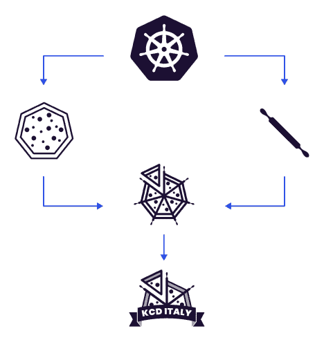
So here is the pizza, an international symbol that is recognized and recognizable, but with some additional Cloud Native details. KCD Italy’s pizza appears sliced inside a rudder made up of rolling pins, because Kubernetes is about passion even ahead of work.
Kitsch? Cheap? Stereotypical? No, come on, it’s good. Lots of humour and lightness in a period in which we are all exhausted and tired of taking ourselves too seriously, a complex period in which we want to look at things from the outside for what they are with simplicity, without permeating everything with useless superstructures.
So here we are, pizza is an invitation from Italy to the entire CNCF community in every part of the world: we can’t wait to come back to meeting in person, to shake hands, get to know each other, and eat a pizza together (wait and see what we have already thought of for the 2022 edition!).
At this point, however, we want to tell you about the logo, and borrow the words of the designers.
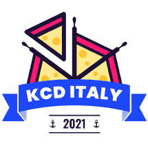
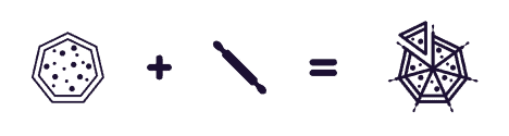
The KCD Italy 2021 logo represents a sliced half-pizza arranged between rolling pins that evoke the steering arms of a Kubernetes rudder. Beneath a festoon to underline the student spirit of the moment and confer a cheerful solemnity at the same time. We added small anchors because there are many nautical references in Cloud Native, and we did not want to be outdone.
How did it come about? The visual below explains its beginnings.
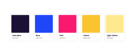
The colours? Well, we reversed the red of the tomato and the light colour of the dough to show that this is a special pizza. And they looked much better like this.
We hope to have conveyed the depth of meaning behind this logo, which is a symbol of good times but also of a strong sense of sharing.We look forward to seeing you on 17/18 November for the first edition, but get ready for the one in 2022 (a suggestion below).