


Guest post originally published in the Timescale Blog by Ramon Guiu and John Pruitt
OpenTelemetry is an open source observability framework for cloud-native service and infrastructure instrumentation hosted by the Cloud Native Computing Foundation (CNCF). It has gained a lot of momentum with contributions from all major cloud providers (AWS, Google, Microsoft) as well as observability vendors (including Timescale) to the point it has become the second project with the most activity and contributors only after Kubernetes.
Last October, we added beta support for OpenTelemetry traces to Promscale, the observability backend powered by SQL. A trace (or distributed trace) is a connected representation of the sequence of operations that were performed across all microservices involved in order to fulfill an individual request. Each of those operations is represented using a span. Each span includes a reference to the parent span except the first one which is called the root span. As a result, a trace is a tree of spans. We told you everything about OpenTelemetry traces in this blog post.
However, it’s better to learn by doing. When talking about OpenTelemetry traces and Promscale, we often wished we had access to a microservices demo application instrumented with OpenTelemetry, so users could play with it to directly experience the potential of tracing. For example, in the blog post we referenced earlier, we used Honeycomb’s fork of Google’s microservices demo, which adds OpenTelemetry instrumentation to those services. But while it is a great demo of a microservices environment, we found it too complex and resource-heavy to run it locally on a laptop for the purposes of playing with OpenTelemetry, since it requires a Kubernetes cluster with 4 cores and 4 GB of available memory.
This inspired us to build a more accessible and lightweight OpenTelemetry demo application:
https://github.com/timescale/opentelemetry-demo/
In this blog post, we’ll introduce you to this demo, which consists of a password generator overdesigned as a microservices application. We’ll dive into its architecture, we’ll explain how we instrumented the code to produce OpenTelemetry traces, how to get the demo up and running on your computer in a few minutes, and how to analyze those traces with Jaeger, Grafana, Promscale, and SQL to understand how the system behaves and to troubleshoot problems.
But that’s not all: later in the post, we will walk you through the six (!) prebuilt Grafana dashboards that come with the demo. These are powerful dashboards that will give you a deep understanding of your systems by monitoring throughput, latency, and error rate. You will also be able to understand upstream and downstream service dependencies.
Even if we built this demo to make it easier for users to experiment with Promscale, this demo application is not Promscale-specific. It can be easily configured to send the telemetry it generates to any OpenTelemetry-compatible backend and we hope the broader community, even those not using Promcale, will find it useful.
To learn about Promscale, check out our website. If you start using us, join the #promscale channel in our Slack Community and chat with us about observability, Promscale, and anything in between – the Observability team is very active in #promscale! Plus, we just launched our Timescale Community Forum. Feel free to shoot us any technical questions there as well.
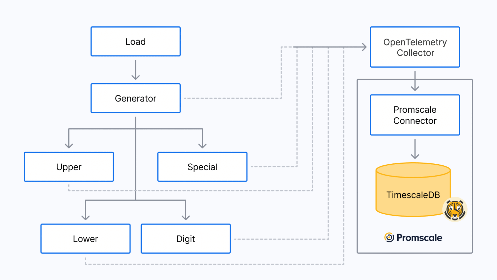
Demo Architecture
The demo application is a password generator that has been overdesigned to run as a microservices application. It includes five microservices:
- The generator service is the entry point for requests to generate a new password. It calls all other services to create a random password.
- The upper service returns random uppercase letters (A-Z).
- The lower service returns random lowercase letters (a-z).
- The digit service returns random digits (0-9).
- The special service returns random special characters.
Apart from the microservices, the demo also deploys a pre-configured OpenTelemetry observability stack composed of the OpenTelemetry Collector, Promscale, Jaeger, and Grafana:
Obviously, this is a silly design – this is not how you would design a password generator. But we decided to use this application because it’s a very easy-to-understand example (everybody is familiar with creating secure passwords), the code is simple, and it’s very lightweight, so you can easily run it on a computer with Docker (no Kubernetes required).
To make the traces generated more interesting, the code of the services introduces random wait times and errors. There is also a bug in the code of one of the services (an Easter egg 👀 for you to find!).
All services are built in Python, except the lower service, which is built in Ruby. The demo also includes a load generator that makes requests to the generator service to create new passwords. It instantiates three instances of that load generator.
Instrumentation
The first step to start getting visibility into the performance and behaviors of the different microservices is to instrument the code with OpenTelemetry to generate traces. The five microservices included in the demo have already been instrumented; in this section, however, we’ll explain how we did it, in case you’re interested in learning how to instrument your own.
OpenTelemetry provides SDKs and libraries to instrument code in a variety of different languages. SDKs allow you to manually instrument your services; at the time of this writing, the OpenTelemetry project provides SDKs for 12 (!) languages (C++, .NET, Erlang/Elixir, Go, Java, Javascript, PHP, Python, Ruby, Rust, and Swift). The maturity of those SDKs varies though – check the OpenTelemetry instrumentation documentation for more details.
Additionally, OpenTelemetry provides automatic instrumentation for many libraries in a number of languages like Python, Ruby, Java, Javascript, or .NET. Automatic instrumentation typically works through library hooks or monkey-patching library code. This helps you get a lot of visibility into your code with very little work, dramatically reducing the amount of effort required to start using distributed tracing to improve your applications.
For services written in Python, you could leverage auto-instrumentation and not have to touch a single line of code. For example, for the generator service and after setting the OTEL_EXPORTER_OTLP_ENDPOINT environment variable to the URL of the OTLP endpoint (the OpenTelemetry Collector for example) where you want data to be sent, you would run the following command to auto-instrument the service:
opentelemetry-instrument --traces_exporter otlp python generator.py
As we just mentioned, we already instrumented the code of the different microservices in our password generator demo. In our case, we decided to manually instrument the code, to show how it is done and in order to add some additional instrumentation, but that is not required.
To instrument the Python services, first we imported a number of OpenTelemetry libraries:
from opentelemetry import trace
from opentelemetry.trace import StatusCode, Status
from opentelemetry.instrumentation.flask import FlaskInstrumentor
from opentelemetry.instrumentation.requests import RequestsInstrumentor
from opentelemetry.sdk.resources import Resource
from opentelemetry.sdk.trace import TracerProvider
from opentelemetry.sdk.trace.export import BatchSpanProcessor
from opentelemetry.exporter.otlp.proto.grpc.trace_exporter import OTLPSpanExporter
Then, we initialized and set up the tracing instrumentation for the service, including setting up the Flask and HTTP auto-instrumentation:
trace.set_tracer_provider(TracerProvider(resource=Resource.create({"service.name": "generator"})))
span_exporter = OTLPSpanExporter(endpoint="collector:4317")
trace.get_tracer_provider().add_span_processor(BatchSpanProcessor(span_exporter))
FlaskInstrumentor().instrument_app(app)
RequestsInstrumentor().instrument()
tracer = trace.get_tracer(__name__)
And finally, we added some manual spans with tracer.start_as_current_span(name) for each operation, and some events with span.add_event(name):
def uppers() -> Iterable[str]:
    with tracer.start_as_current_span("generator.uppers") as span:
        x = []
        for i in range(random.randint(0, 3)):
            span.add_event(f"iteration_{i}", {'iteration': i})
            try:
                response = requests.get("http://upper:5000/")
                c = response.json()['char']
            except Exception as e:
                e = Exception(f"FAILED to fetch a upper char")
                span.record_exception(e)
                span.set_status(Status(StatusCode.ERROR, str(e)))
                raise e
            x.append(c)
        return x
Check the code of the generator, upper, digit or special services for complete examples.
For the Ruby service, we did something similar. Check the code of the lower service for more details!
Running the demo
The demo uses docker-compose to get all components up and running on your computer. Therefore, before running it, you first need to install the Docker Engine and Docker Compose as prerequisites. We’ve tested the demo on recent versions of MacOS (both Intel and M1 processors), Linux (tested on Ubuntu) and Windows.
The opentelemetry-demo GitHub repo has everything you need to run the demo. First, clone the repo:
git clone https://github.com/timescale/opentelemetry-demo.git
Or if you prefer, just download it and unzip it.
Next, go into the opentelemetry-demo folder (or opentelemetry-demo-main if you used the download option):
cd opentelemetry-demo
And run:
docker-compose up --detachNote: on Linux systems the default installation only gives the root user permissions to connect to the Docker Engine and the previous command would throw permission errors. Running sudo docker-compose up –detach would fix the permissions problems by running the command as root but you may want to grant your user account permission to manage Docker.
This will execute the instructions in the docker-compose.yaml file, which will build a Docker image for each service. This could take a few minutes. Then, run all the different components of the demo environment. When docker-compose completes, you should see something like the following:
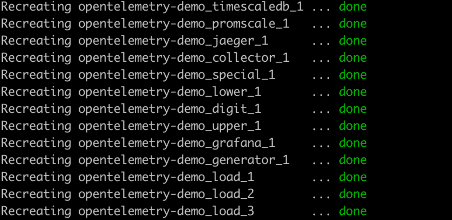
And that’s it. Congratulations! You have a microservices application instrumented with OpenTelemetry sending traces to an OpenTelemetry observability stack.
If at any point you want to stop the demo, just run docker-compose down.
We’ll talk about Jaeger and Grafana extensively in the next sections of this blogpost, but as a quick note – Jaeger runs on http://localhost:16686/ and Grafana on http://localhost:3000/ . Grafana will require credentials to log in for the first time: use admin for the username, and also admin for the password. You will be able to update your password immediately after.
Visualize individual traces with Jaeger
Now that you have the entire demo up, including the password generator microservices and the preconfigured OpenTelemetry observability stack, you are ready to start playing around with the generated traces.
As we explained earlier, traces represent a sequence of operations, typically across multiple services, that are executed in order to fulfill a request. Each operation corresponds to a span in the trace. Traces follow a tree-like structure, and thus most tools for visualizing traces offer a tree view of all the spans that make up a trace.
Jaeger is the most well-known open source tool for visualizing individual traces. Actually, Jaeger is more than just visualization, as it also provides libraries to instrument code with traces (which will be deprecated soon in favor of OpenTelemetry), a backend service to ingest those traces, and an in-memory and local disk storage. Jaeger also provides a plugin mechanism and a gRPC API for integrating with external storage systems. (Promscale implements such gRPC API to integrate with Jaeger; actually, the Promscale team contributed it to the project!)
Jaeger is particularly helpful when you know your system is having a problem and you have enough information to narrow down the search to a specific set of requests. For example, if you know that some users of your application are experiencing very slow performance when making requests to a specific API, you could run a search for requests to that API that have taken more than X seconds, and from there visualize several individual traces to find a pattern of which service and operation is the bottleneck.
Let’s turn to our simple demo application to show an example of this. If you have the demo application running, you can access Jaeger here.
Now, let’s say we know there are some requests to generate a password that are taking more than 10 seconds. To find the problematic requests, we could filter traces in Jaeger to the generator service that have taken more than 10 seconds, and sort them by “Longest First”:
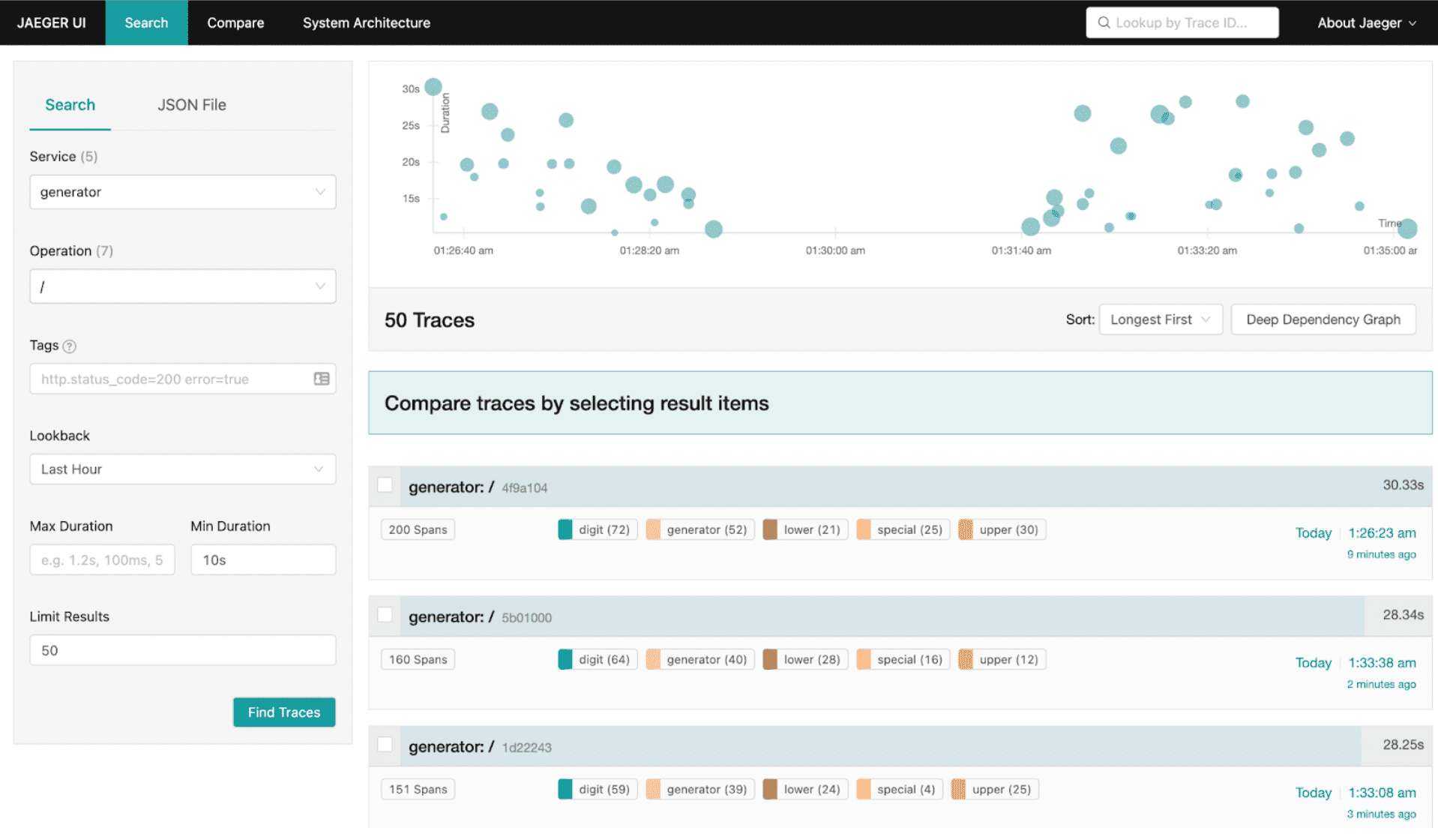
In our case, we are seeing a request with 200 spans taking more than 30 seconds. Let’s open that trace and see why it is taking so long:
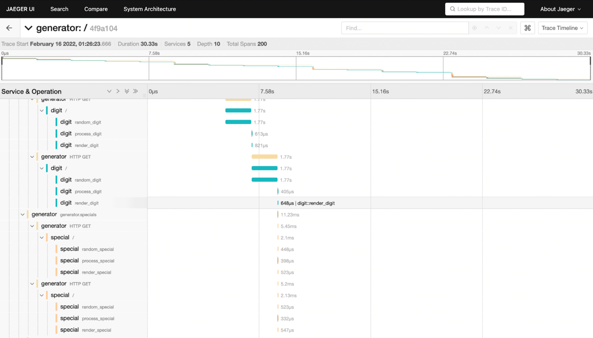
After inspecting it carefully, we can see that the random_digit operation in the digit service is taking more than 1 second every time it runs, while other operations are usually run in a few microseconds or milliseconds. If we go back to the list of traces, and open another slow trace, we will see that it points again to the same problem.
With that information, we can now go inspect the code of the random_digit operation in the digit service, which reveals the problem:
def random_digit() -> str:
    with tracer.start_as_current_span("random_digit") as span:
        work(0.0003, 0.0001)

        # slowness varies with the minute of the hour
        time.sleep(sin(time.localtime().tm_min) + 1.0)

        c = random.choice(string.digits)
        span.set_attribute('char', c)
        return c
Now we can see why this operation is giving us trouble: it’s because the code is calling the time.sleep function, which is slowing it down!
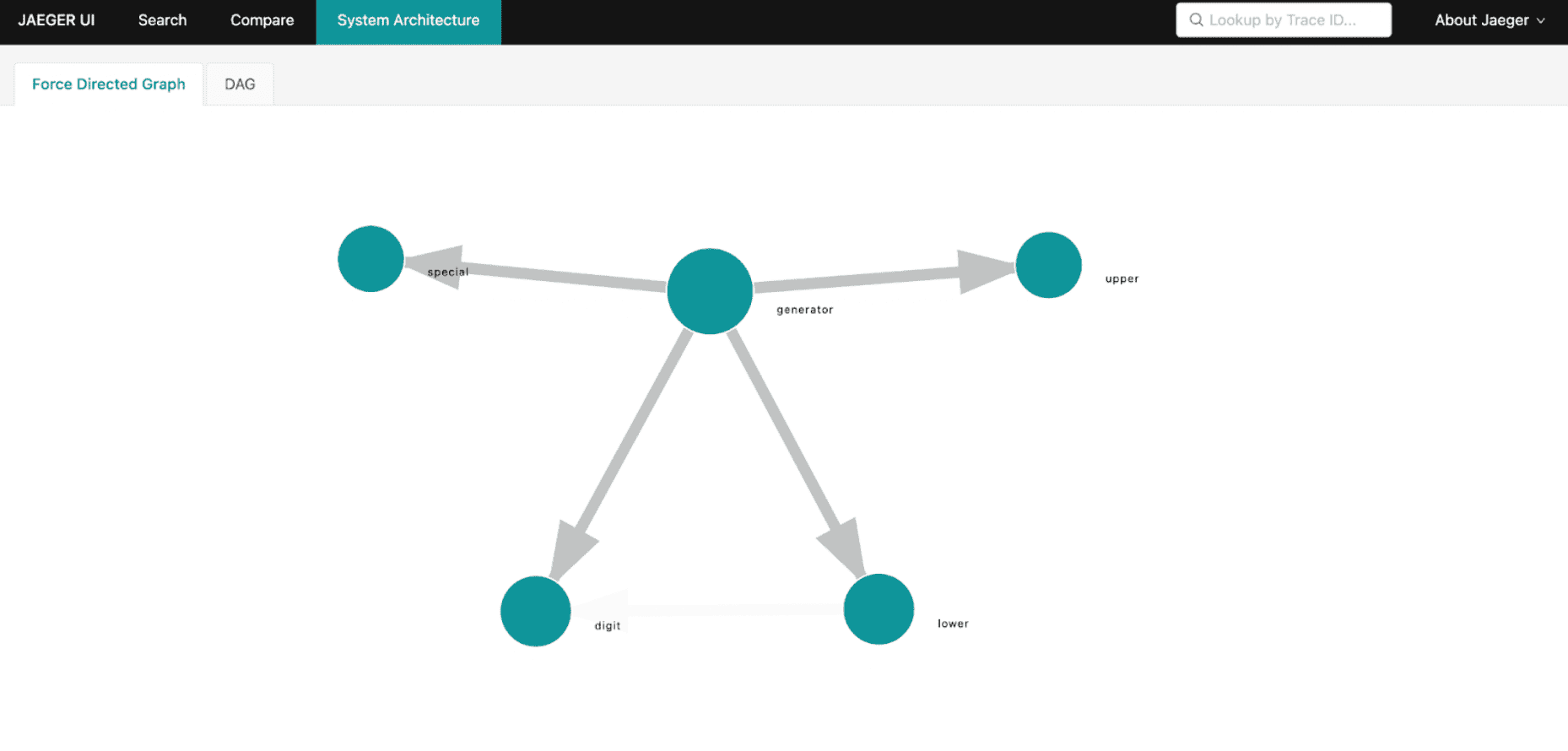
Besides trace visualization, Jaeger also provides a service map of your microservices architecture generated from trace data. This is useful to get an overview of service dependencies, which can help identify unexpected dependencies and also ways to simplify or optimize the architecture of your application. For example, the map below shows us how the generator service calls all the other services:
Analyze the performance and behavior of the application with Grafana and SQL
Jaeger is a fantastic tool to understand individual traces, but it doesn’t provide a query language to analyze and aggregate data as needed. Traces have a wealth of information that you can use to better understand how your system is performing and behaving – if you have the ability to run arbitrary queries on the data. For example, you can’t compute the throughput, latency, and error rate of your services with Jaeger.
This is where Promscale can help you. The observability stack deployed by the password generator demo stores all OpenTelemetry traces in Promscale through its endpoint that implements the OpenTelemetry Protocol (OTLP). And because Promscale is built on top of TimescaleDB and PostgreSQL, it allows you to run full SQL to analyze the data.
In this section, we’ll tell you how to use Grafana to analyze traces with a set of predefined dashboards that query the data in Promscale using SQL. These dashboards allow you to monitor the three golden signals often used to measure the performance of an application: throughput, latency, and error rate. We’ve also built dashboards that will help you understand your upstream and downstream service dependencies.
We have built six predefined dashboards to do different analysis, all of them included in our microservices demo:
- Request rates or throughput
- Request durations or latency
- Error rates
- Service dependencies
- Upstream dependencies
- Downstream dependencies
Let’s get into them.
Request rates
It’s possible to compute throughput of your services from traces, if you can query and aggregate them like you can do with SQL. Before showing you how to do that though, it is important to notice that this requires that all trace data is stored, or the results will not be accurate. It is not uncommon to use downsampling to only keep a representative set of traces to reduce the compute and storage requirements, but if traces are downsampled, the computed request rate won’t be exact.
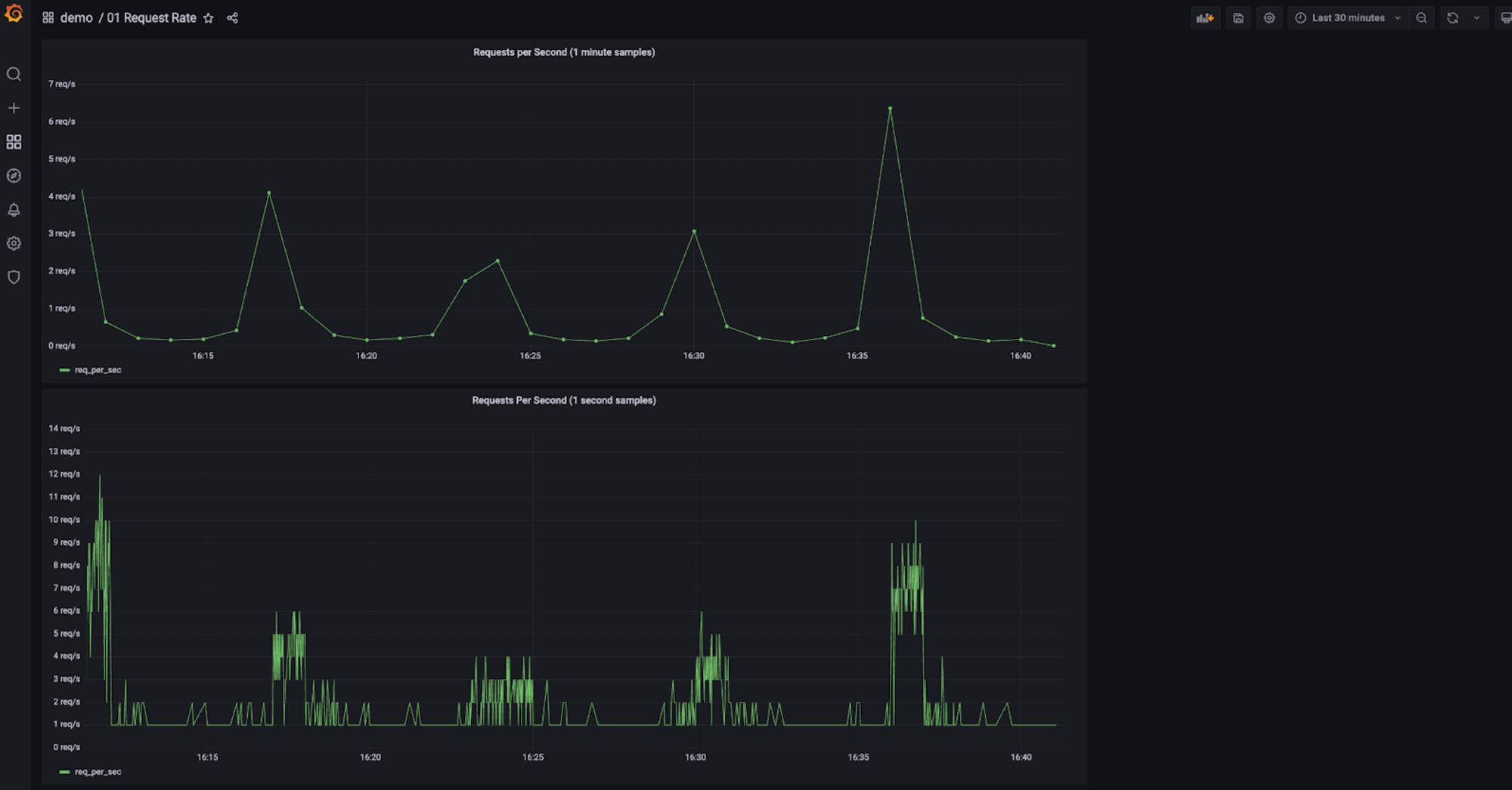
In our demo, the Request Rate dashboard shows the evolution of throughput (i.e. request rate) over time. It has two charts: the first one computes the requests per second using one-minute time buckets (lower resolution, equivalent to the average requests per second in each minute), and the other one uses one-second time buckets.
To generate the requests per second with one-second time buckets (the bottom chart), we used the following SQL query:
SELECT
    time_bucket('1 second, start_time) as time,
    count(*) as req_per_sec
FROM ps_trace.span s
WHERE $__timeFilter(start_time)
AND parent_span_id is null -- just the root spans
GROUP BY 1
ORDER BY 1
The query follows the well-known SELECT, FROM, WHERE SQL structure. Promscale provides the ps_trace.span view that gives you access to all spans stored in the database. If you are not familiar with SQL views, from a query perspective you can think of them as relational tables for simplicity.
This query is just counting all spans (count(*)) in one second buckets (time_bucket('1 second, start_time)) in the selected time window ($__timeFilter(start_time)) that are root spans (parent_span_id is null). Root spans are spans that don’t have a parent: they are the very first span of a trace. So effectively, this condition filters out internal requests between the microservices that make up the password generator while keeping those that originate from outside of the system – that is, the actual requests that users make to the application.
If you want to run the query outside of Grafana, replace $__timeFilter(start_time) with the corresponding condition on start_time. For example, to limit the query to the last 30 minutes, replace $__timeFilter(start_time) with start_time < NOW() - INTERVAL '30 minutes' .
Request durations
Latency is also key to understanding if your application is responding fast and delivering a good experience to your users. The most common way to look at latency is by using histograms and percentiles. Histograms indicate the distribution, while percentiles help you understand what percentage of requests took X amount of time or less. Common percentiles are 99th, 95th and 50th, which is usually known as the median.
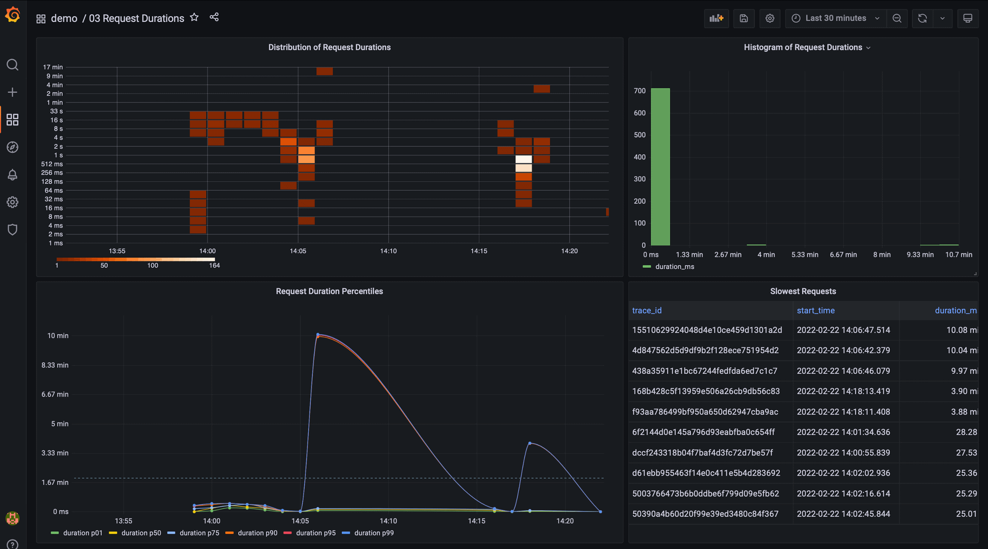
The Request Durations dashboard uses a number of different Grafana panels to analyze request latency in our password generator demo.
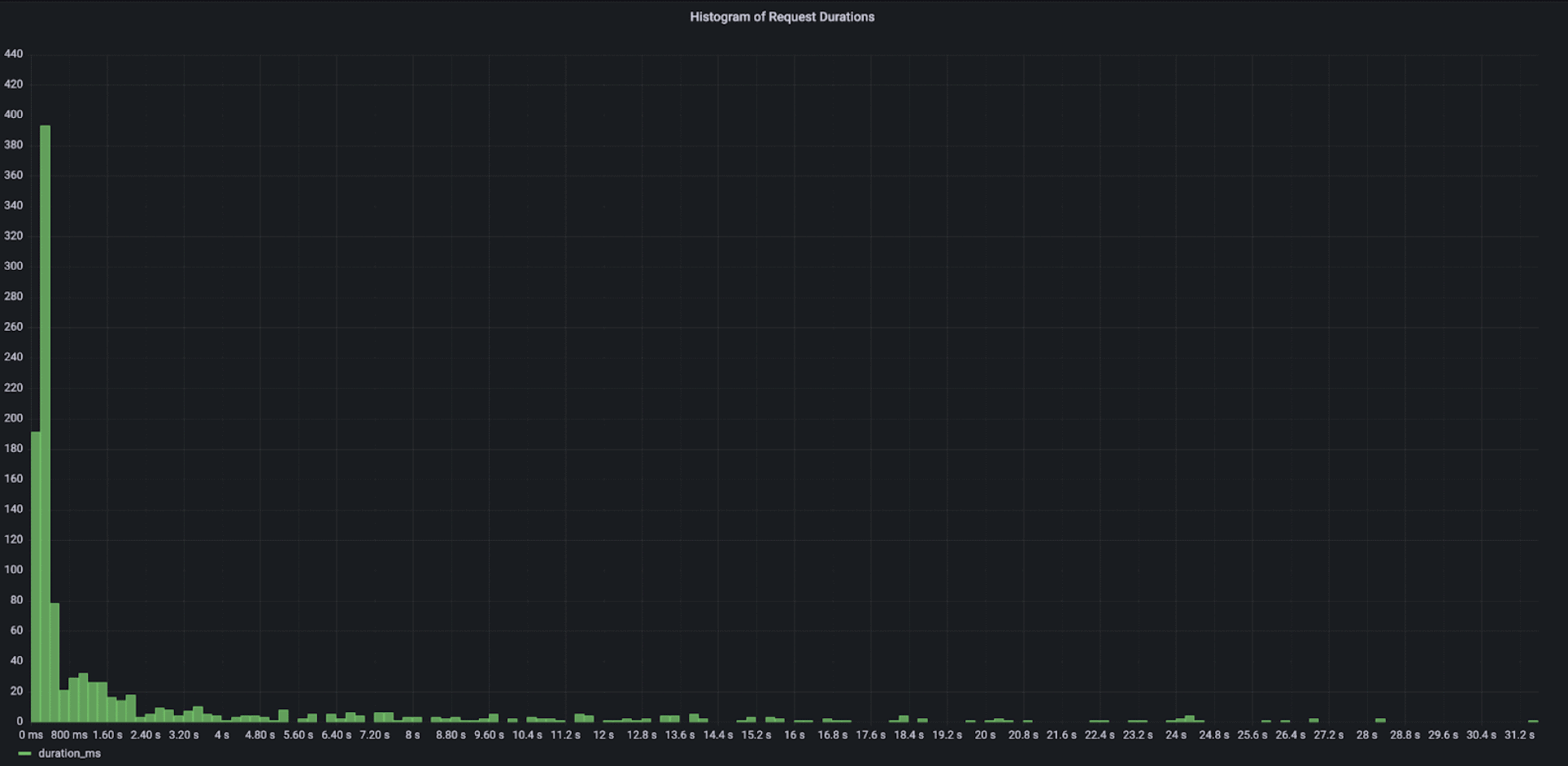
How did we build this? The easiest way to display a histogram is to use Grafana’s Histogram panel with a query that returns the duration of each request to the system in the selected time window:
SELECT duration_ms
FROM ps_trace.span
WHERE $__timeFilter(start_time)
AND parent_span_id is null
The histogram view shows that the majority of user requests take less than one second. However, there is a long tail of requests that are taking a long time, up to 30 seconds, which is a very poor user experience for a password generator:
The previous query is not very efficient if you have lots of requests. A more optimized way of doing this would be to use TimescaleDB’s histogram function and compute the histogram buckets in the database:
SELECT histogram(duration_ms, 100, 10000, 20)
FROM ps_trace.span
WHERE $__timeFilter(start_time)
AND parent_span_id is null
The query above would generate a histogram for the duration_ms column with a lower bound of 100 ms, an upper bound of 10,000 ms (i.e. 10 seconds), and 20 buckets. The output of that query would look something like this:
{7,98,202,90,33,23,21,20,15,16,9,10,11,11,8,5,5,4,5,6,4,91}
Each of those values corresponds to one bucket in the histogram. Unfortunately, there isn’t an out-of-the-box Grafana panel that can use this input to display a chart. However, with some SQL magic it can be converted into something that could easily be displayed in a Grafana panel.
When using metric instrumentation instead of trace instrumentation, you have to define the buckets when you initially define the metric and therefore you can’t change the histogram buckets later for data that has already been stored. For example, imagine that you set a lower bound of 100ms, but you realize later when investigating an issue that it would have been valuable to you to have a lower bound of 10ms.
With traces though, you can change the structure of your histogram as needed, since they are computed at query time. Additionally, you have the flexibility to filter the histogram to show the latency of requests having certain tags – like the latency of requests made by a specific customer, for instance.
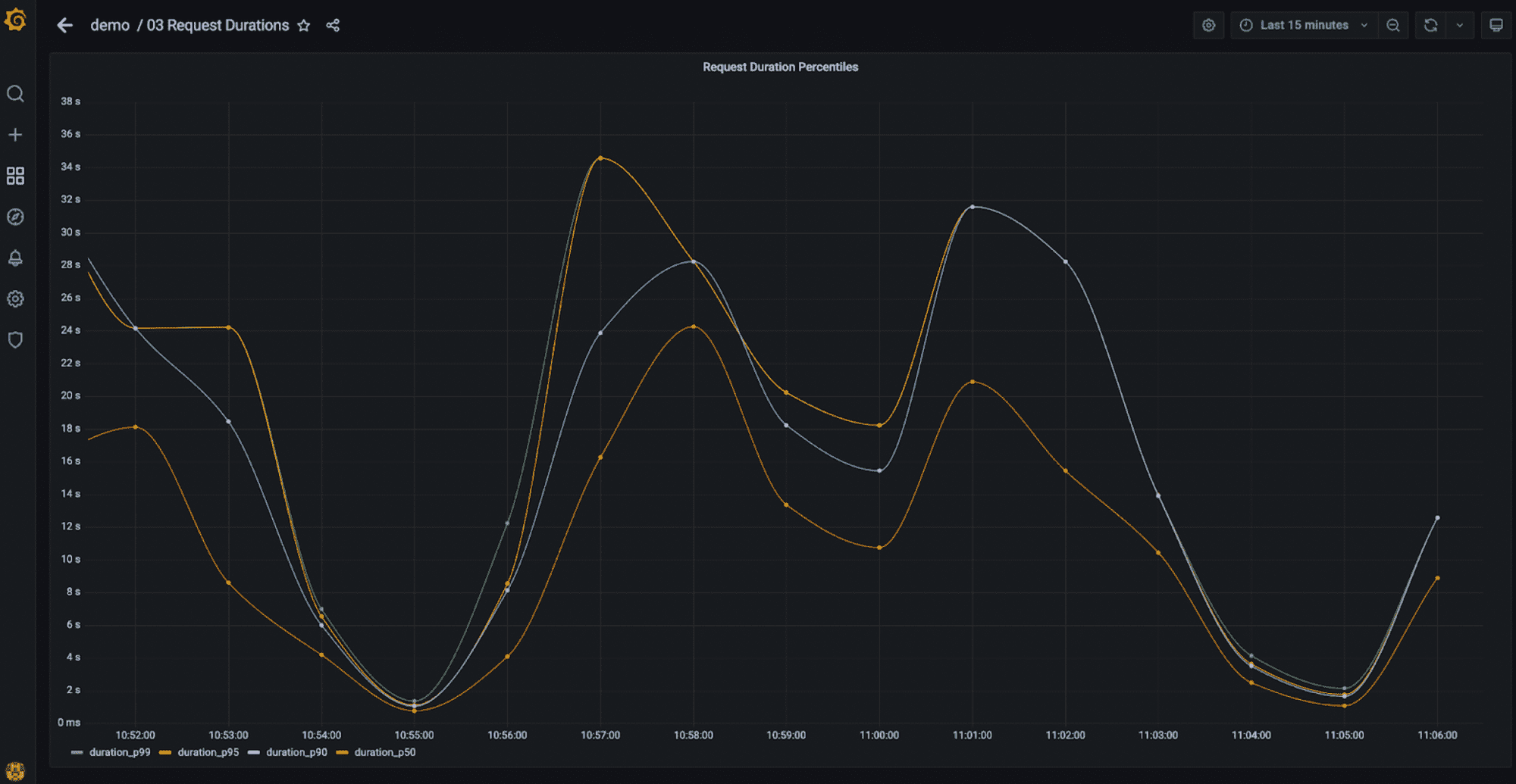
TimescaleDB also provides functions to compute percentiles. The following query can be used to see the evolution of different percentiles over time:
SELECT
    time_bucket('1 minute', start_time) as time,
    ROUND(approx_percentile(0.99, percentile_agg(duration_ms))::numeric, 3) as duration_p99,
    ROUND(approx_percentile(0.95, percentile_agg(duration_ms))::numeric, 3) as duration_p95,
    ROUND(approx_percentile(0.90, percentile_agg(duration_ms))::numeric, 3) as duration_p90,
    ROUND(approx_percentile(0.50, percentile_agg(duration_ms))::numeric, 3) as duration_p50
FROM span
WHERE
    $__timeFilter(start_time)
    AND parent_span_id is null
GROUP BY time
ORDER BY time
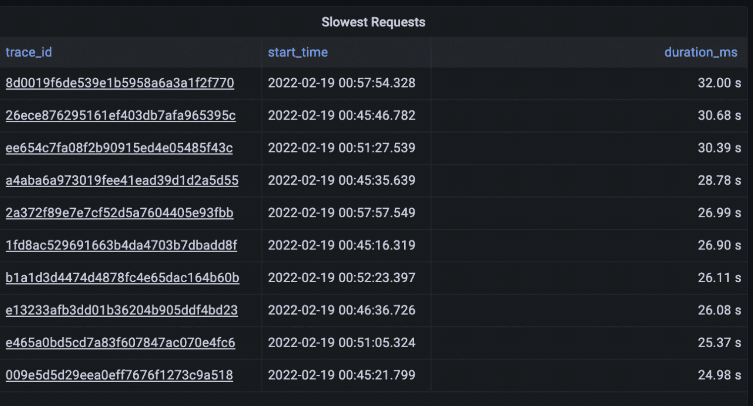
Finally, you can also use SQL to just return the slowest requests across all traces, something that is actually not possible to do with Jaeger when the volume of traces is high. Jaeger limits the amount of traces you can retrieve to 1,500 and sorting is implemented in the UI. Therefore, if there are more than 1,500 matching traces in the selected timeframe, you’ll have no guarantee that you’ll actually see the slowest traces.
With Promscale and SQL, you are sure to get the latest traces regardless of how many there are because sorting is performed in the database:
SELECT
  trace_id,
  start_time,
  duration_ms
FROM ps_trace.span
WHERE $__timeFilter(start_time)
AND parent_span_id is null
ORDER BY duration_ms DESC
LIMIT 10;
One more interesting thing. In the Request Durations dashboard, the query we use is slightly different:
SELECT
  replace(trace_id::text, '-'::text, ''::text) as trace_id,
  start_time,
  duration_ms
FROM ps_trace.span
WHERE $__timeFilter(start_time)
AND parent_span_id is null
ORDER BY duration_ms DESC
LIMIT 10;
The difference is that we remove “-” from the trace id. We do that because we store the original trace id as reported by OpenTelemetry, but in the dashboard, we do a nice trick to link the trace id directly to the Grafana UI, so we can visualize the corresponding trace (Grafana expects a trace id with “-” removed).
If you want to see this in action, open the dashboard and click on a trace id. It’s pretty cool, and it works thanks to the high number of options for customizing your dashboard that Grafana provides. A shootout to the Grafana team!
Error rates
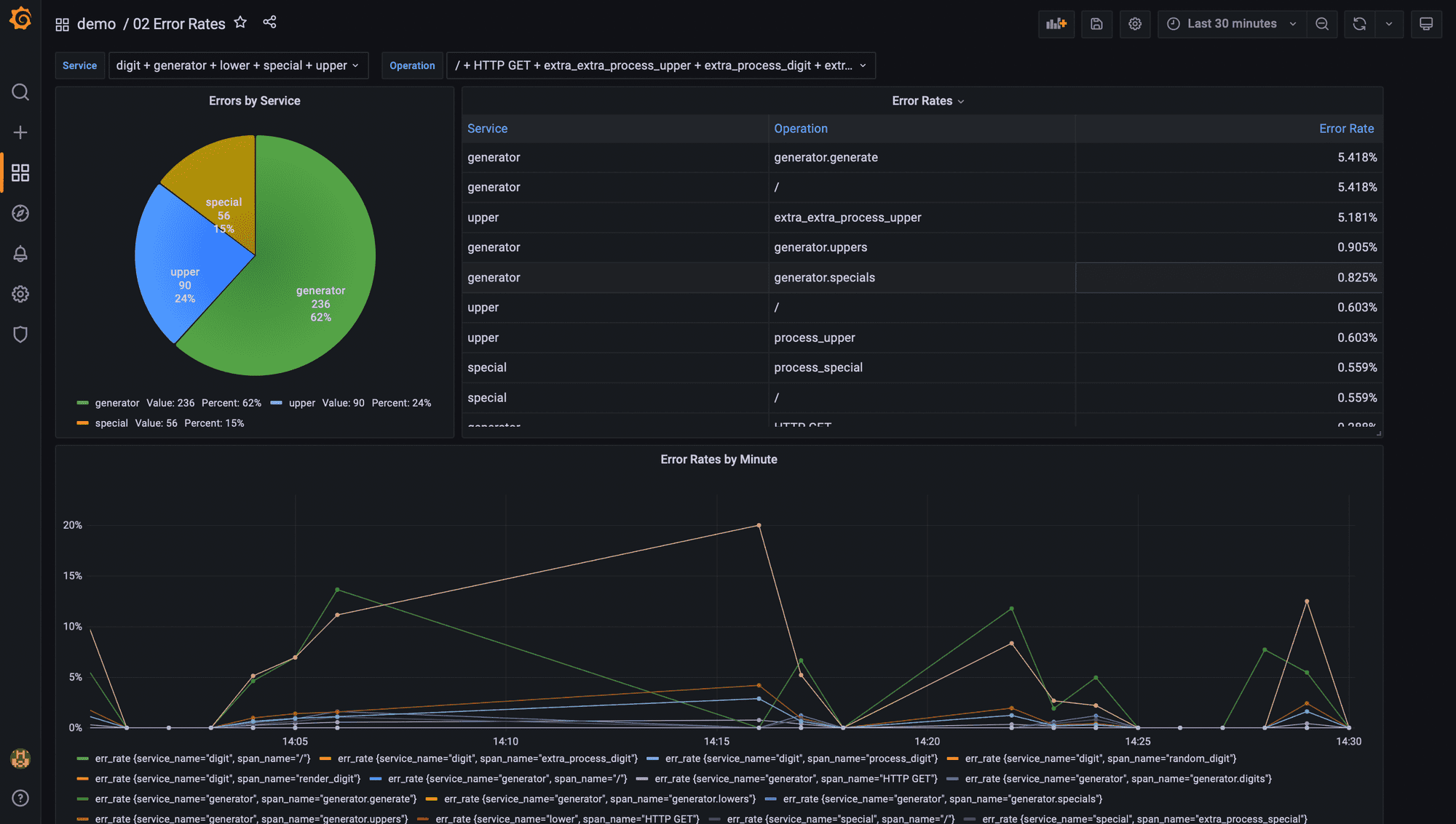
Error rate is the third golden signal for measuring application and service performance. When an operation in a request does not complete successfully, OpenTelemetry marks the corresponding span(s) with an error status. In Promscale, a span with error is indicated with status_code = STATUS_CODE_ERROR
To compute the error rate per operation in the selected time window in Grafana, you would run the following query:
SELECT
    x.service_name,
    x.span_name,
    x.num_err::numeric / x.num_total as err_rate
FROM
(
    SELECT
        service_name,
        span_name,
        count(*) filter (where status_code = 'STATUS_CODE_ERROR') as num_err,
        count(*) as num_total
    FROM ps_trace.span
    WHERE $__timeFilter(start_time)
    GROUP BY 1, 2
) x
ORDER BY err_rate desc
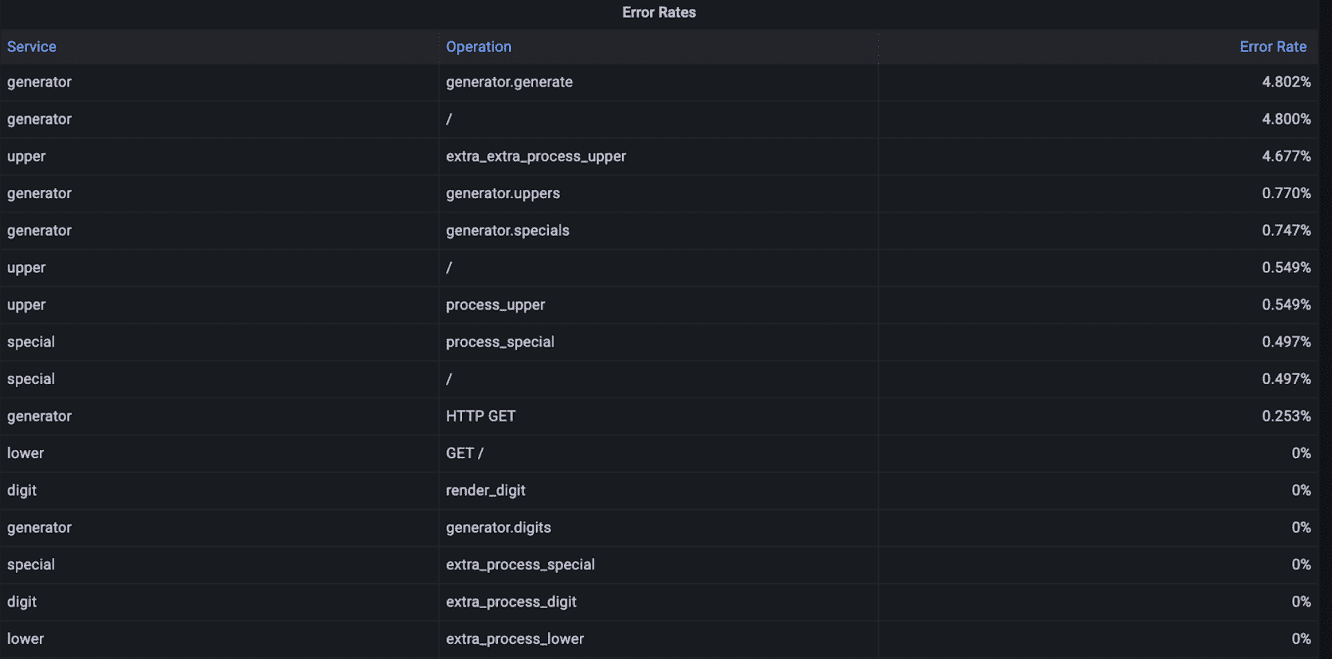
All OpenTelemetry spans include a service_name to indicate the name of the service that performed the operation represented by the span, and a span_name to identify the specific operation.
Service dependencies
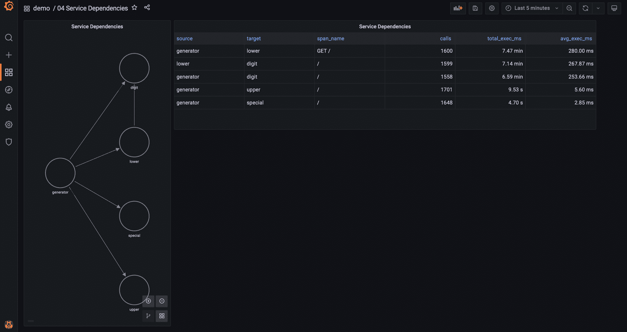
So far we have learned how to analyze data across all services, per service, or per operation to compute the three golden signals: throughput, latency, and error rate. In the next three sections, we are going to leverage the information in traces to learn about how services communicate with each other to understand the behavior of the system.
We saw that Jaeger can display a service map out of the traces being ingested. Actually, with SQL and Grafana you can get a lot more valuable insights from the same trace data. Using the Grafana node graph panel we can generate a service map similar to the one Jaeger provides that also indicates the number of requests between services:
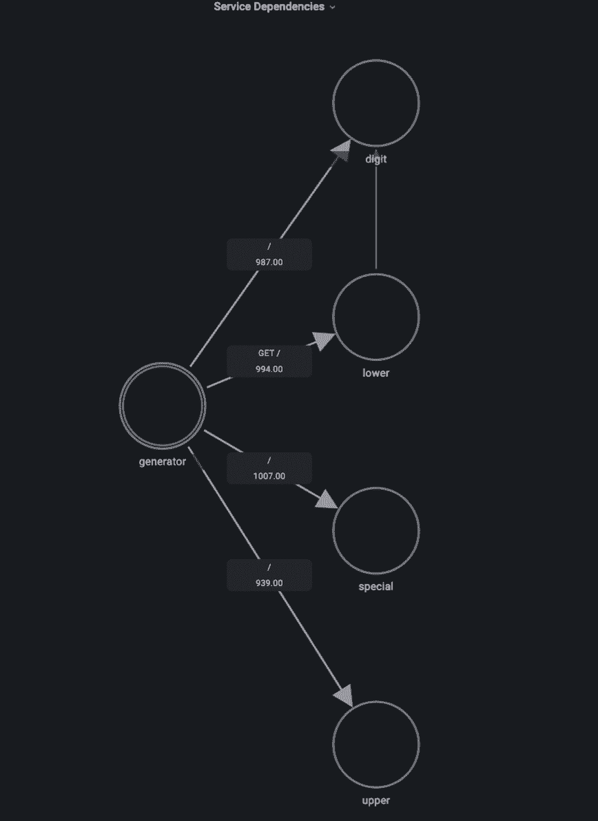
This dependency map already tells us that something seems to be wrong, as we see that the lower service is calling the digit service – that doesn’t make any sense! If we’d do a careful inspection of the code, it would reveal that there is a bug calling the digit service every time it receives a request to generate a lowercase character for no reason. Problem solved!
The node graph panel requires two inputs to build this visualization: a first query that returns the list of nodes, and a second query that returns the edges that connect those nodes.
The nodes in our service map are the services that are part of the application. The query below retrieves all the different service_names that appear in spans during the selected timeframe. The node graph panel requires an id and a title for each node, and we use the same value for both:
SELECT
   service_name as id,
   service_name as title
FROM ps_trace.span
WHERE $__timeFilter(start_time)
GROUP BY service_name
Then, we need a query to get the list of edges. The edges indicate dependencies between services, that is, that service A calls service B.
SELECT
    p.service_name || '->' || k.service_name || ':' || k.span_name as id,
    p.service_name as source,
    k.service_name as target,
    k.span_name as "mainStat",
    count(*) as "secondaryStat"
FROM ps_trace.span p
INNER JOIN ps_trace.span k
ON (p.trace_id = k.trace_id
AND p.span_id = k.parent_span_id
AND p.service_name != k.service_name)
WHERE $__timeFilter(p.start_time)
GROUP BY 1, 2, 3, 4
This query joins the span view with itself because an individual span does not have any information about the parent span other than the parent span id. And so, we need to do a join on the parent span id to identify calls between different services (i.e. the span and the parent span were generated by different services):
p.trace_id = k.trace_id
AND p.span_id = k.parent_span_id
AND p.service_name != k.service_name
The node graph panel requires an id, a source node, a target node, and optionally a main statistic and a secondary statistic to display in the graph. The id generated in the query is an arbitrary string we defined that includes the service making the requests, the service receiving those requests and which operation the parent service called.
By doing that, if service A calls different operations in service B, the service map will show multiple arrows (one for each operation) instead of just one, which helps you understand the dependencies between services in more detail. This is not the case in the demo environment (as each service only calls one operation in another service), but it could be useful in other situations. And if you prefer to group all operations together, you would just need to remove k.span_name from the id in the query.
This is the power of using SQL for all of this: you have full flexibility to get the information you are interested in!
One more thing: you can compute additional statistics to help you further understand how services are interacting. For example, you may be interested in seeing not only how many times a service is calling another service, but also how much total time is spent by the receiving service in those calls, and what’s the average (you could also compute the median, or p99, or anything you want really) of each of those calls.
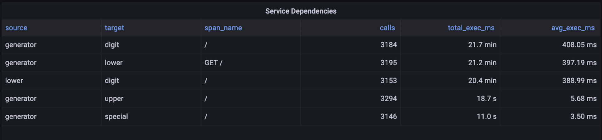
The table above was generated with a Grafana table panel using the query below, that again joins the span view with itself:
SELECT
    p.service_name as source,
    k.service_name as target,
    k.span_name,
    count(*) as calls,
    sum(k.duration_ms) as total_exec_ms,
    avg(k.duration_ms) as avg_exec_ms
FROM ps_trace.span p
INNER JOIN ps_trace.span k
ON (p.trace_id = k.trace_id
AND p.span_id = k.parent_span_id
AND p.service_name != k.service_name)
WHERE $__timeFilter(p.start_time)
GROUP BY 1, 2, 3
ORDER BY total_exec_ms DESC
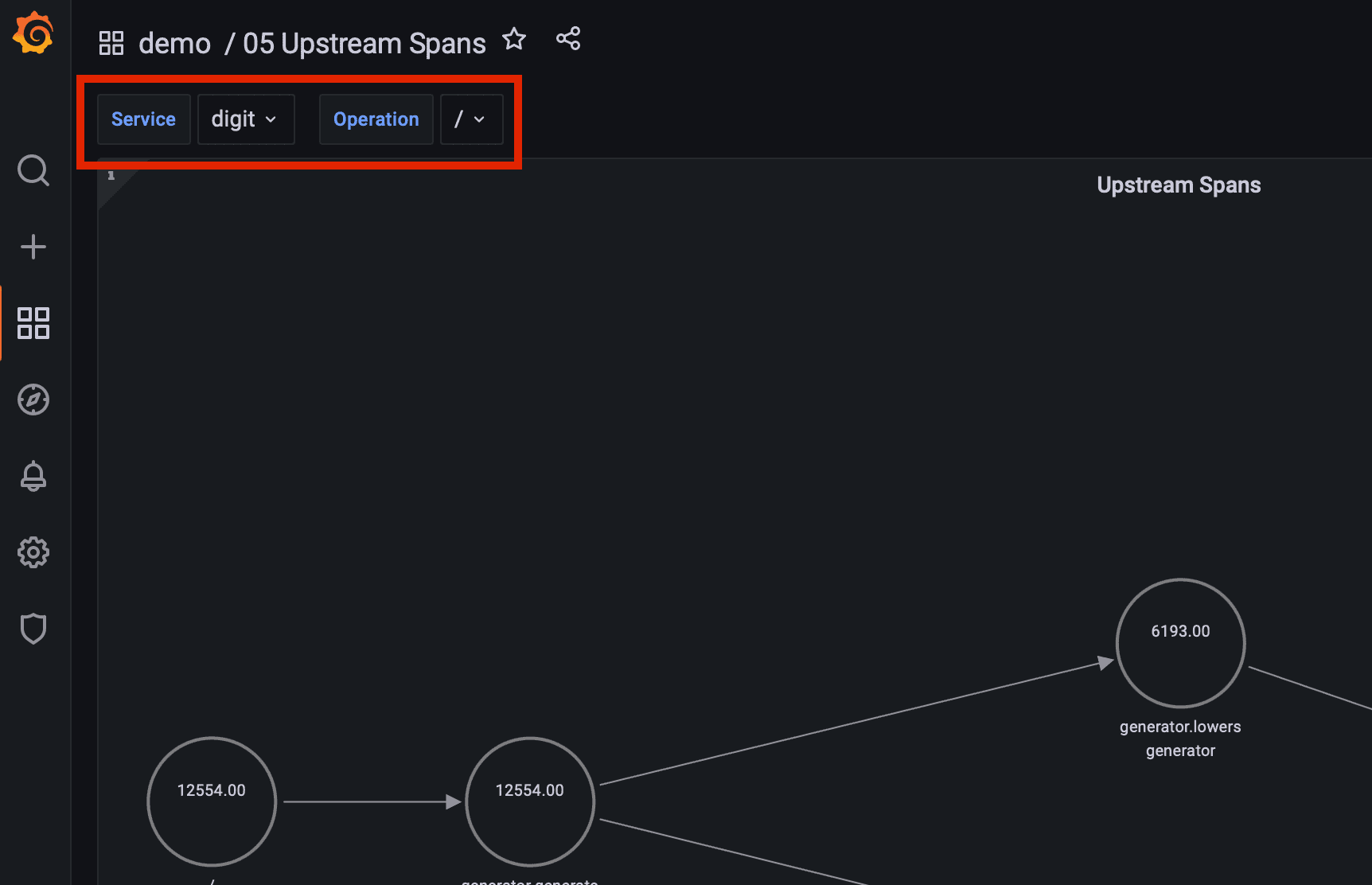
Investigating upstream dependencies

When you are troubleshooting a problem in a microservice it’s often very helpful to understand what is calling that service. Imagine that you saw a sudden increase in the throughput of a particular operation in a microservice: you would like to understand what caused that increase in throughput – that is, what upstream service and operation started making a lot more requests to that microservice operation.
This problem is more complicated than the dependency map problem, as we need to analyze all spans that represent requests to that microservice operation; then, retrieve the calling services; then, do the same for those… And repeat. Basically, we need to recursively traverse the tree of spans to extract all those dependencies.
To visualize the dependencies, we will again use the node graph panel, which requires a query for the list of nodes and a query for the list edges. These are not as straightforward as in the dependency map, because we only want to display services that are in the upstream chain of a specific service and operation. We need a way to traverse the tree of spans for that service and operation backwards.
Luckily, we have the SQL superpowers of Postgres: we can use a recursive query to do this!
The structure of a recursive query in PostgreSQL is the following:
WITH RECURSIVE table_name AS (

     initial_query


     UNION [ALL]
     recursive_query
)
final_query
Let’s break it down:
initial_query: the query that returns the base result set that will be run against the recursive query.recursive_query: a query againsttable_namethat is initially run against the result set ofinitial_query. The results of that query are run against the recursive_query again, and then that result set is run against the recursive_query again and so on until the result set returned by the recursive query is empty.final_query: the results of the initial_query execution and the subsequent recursive_query execution are unioned (if using UNION instead of UNION ALL duplicate rows are discarded). That is, all results from initial_query and all results from subsequent recursive_query executions are put together into one working table and then run against the final_query to generate the query results that are finally returned by the database.
Given a service and operation, this is the query that returns all upstream services and operations by using the WITH RECURSIVE PostgreSQL statement:
WITH RECURSIVE x AS
(
    SELECT
        trace_id,
        span_id,
        parent_span_id,
        service_name,
        span_name
    FROM ps_trace.span
    WHERE $__timeFilter(start_time)
    AND service_name = '${service}'
    AND span_name = '${operation}'
    UNION ALL
    SELECT
        s.trace_id,
        s.span_id,
        s.parent_span_id,
        s.service_name,
        s.span_name
    FROM x
    INNER JOIN ps_trace.span s
    ON (x.trace_id = s.trace_id
    AND x.parent_span_id = s.span_id)
)
SELECT
    md5(service_name || '-' || span_name) as id,
    span_name as title,
    service_name as "subTitle",
    count(distinct span_id) as "mainStat"
FROM x
GROUP BY service_name, span_name
The condition x.parent_span_id = s.span_id in the recursive_query is the one that ensures only parent spans are returned.
Each node represents a specific service and operation. Then for each node, this query will display the number of executions for the corresponding operation (count(distinct span_id) as “mainStat”).
${service} and ${operation} are Grafana variables that are defined at the top of the dashboard and that specify which is the service and operation for which we want to show upstream services and operations.
The query for edges is similar to the query for nodes:
WITH RECURSIVE x AS
(
    SELECT
        trace_id,
        span_id,
        parent_span_id,
        service_name,
        span_name,
        null::text as id,
        null::text as target,
        null::text as source
    FROM ps_trace.span
    WHERE $__timeFilter(start_time)
    AND service_name = '${service}'
    AND span_name = '${operation}'
    UNION ALL
    SELECT
        s.trace_id,
        s.span_id,
        s.parent_span_id,
        s.service_name,
        s.span_name,
        md5(s.service_name || '-' || s.span_name || '-' || x.service_name || '-' || x.span_name) as id,
        md5(x.service_name || '-' || x.span_name) as target,
        md5(s.service_name || '-' || s.span_name) as source
    FROM x
    INNER JOIN ps_trace.span s
    ON (x.trace_id = s.trace_id
    AND x.parent_span_id = s.span_id)
)
SELECT DISTINCT
    x.id,
    x.target,
    x.source
FROM x
WHERE id is not null
In this case, we are setting id, target and source to null in the initial_query because these columns don’t exist in the ps_trace.span view. However, we need to define these columns to be able to do a UNION with the recursive_query, which does define them (the columns in the SELECT clause must be the same for both queries). In the final query, we only keep those rows where id is not null.
This is the end result:
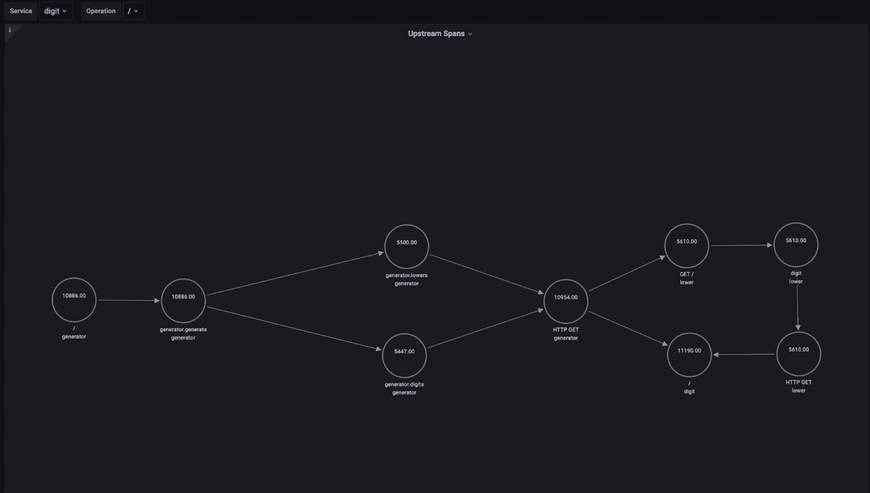
For example, we can see that the digit service is serving a similar number of requests from the lower service as from the generator service.
Investigating downstream dependencies
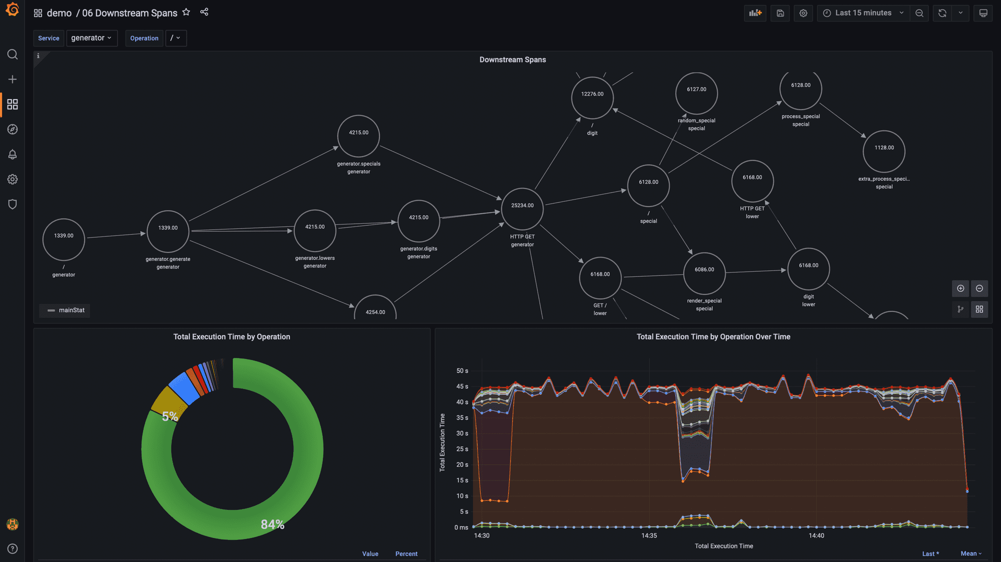
When investigating how to improve the performance of a specific service operation it is extremely useful to get a sense of all the different downstream services and operations that are involved in executing all executions of that service operation.
To create a map of downstream dependencies using traces in Promscale, we’ll use the same approach as for upstream services: we’ll use the node graph panel with recursive SQL queries. The queries will be the same as the ones we used for upstream dependencies but replacing the x.parent_span_id = s.span_id condition in the recursive_query with x.span_id = s.parent_span_id to return the child spans instead of the parent span.
If in the dashboard we select Service: generator and Operation: /, then we basically get the entire map of how services interact, since that service and operation is the only entry point to the password generator application.
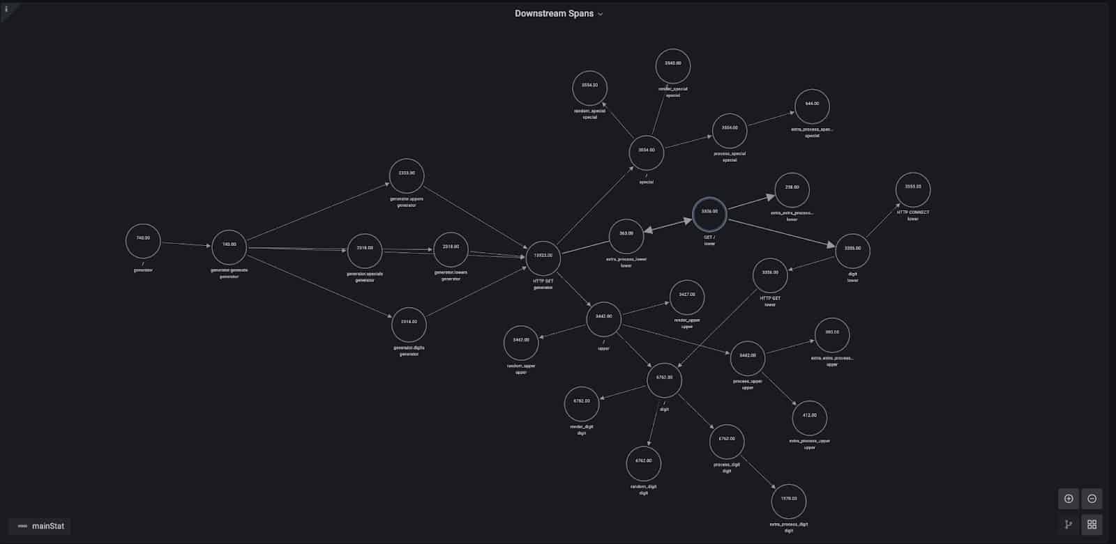
By analyzing downstream dependencies, we can also do other extremely valuable analyses, like looking at which downstream service operation consumes the majority of the execution time for the selected service and operation. This would be very helpful, for example, to decide where to start if we want to improve the performance of a specific service operation.
However, that calculation can’t be done directly by using the duration of each span, since it includes the duration of its child spans – and therefore spans that are higher in the hierarchy will always show as taking the longest to execute. To solve that problem, we subtract to the duration of each span the time spent in child spans.
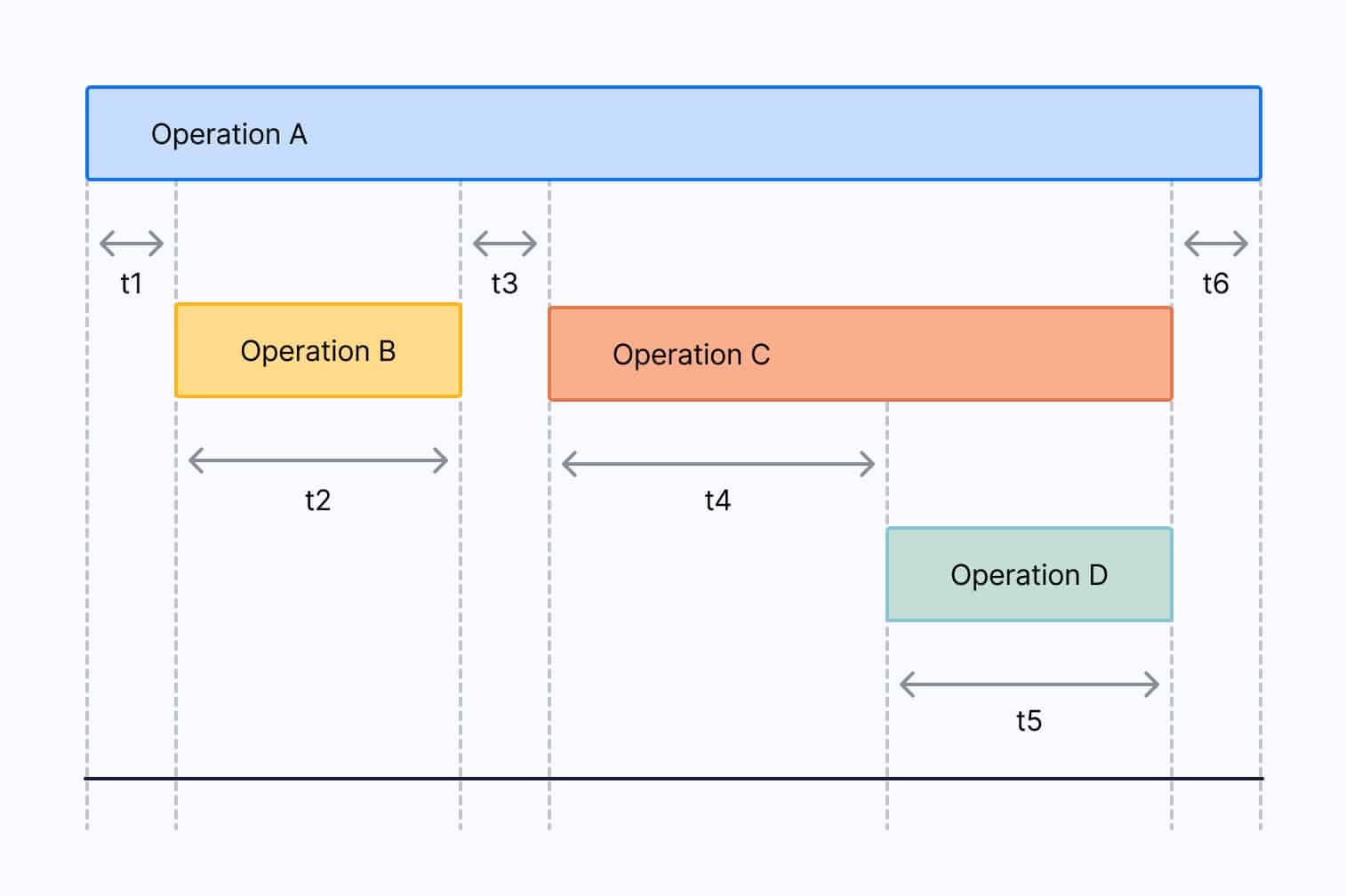
Let’s look at a specific example to illustrate the problem. The diagram below shows a trace with four spans representing different operations. The time effectively consumed by Operation A is t1 + t3 + t6, or expressed differently, the duration of the span for Operation A minus the duration of the span for Operation B minus the duration of the span for Operation C . The time effectively consumed by Operation B is t2, by Operation C is t4, and by Operation D is t5. In this case, Operation C is the one that has consumed most of the time in the trace.
To perform this calculation in aggregate for all traces starting with a specific service and operation, we can run the following recursive query:
WITH RECURSIVE x AS
(
    SELECT
        s.trace_id,
        s.span_id,
        s.parent_span_id,
        s.service_name,
        s.span_name,
        s.duration_ms - coalesce(
        (
            SELECT sum(z.duration_ms)
            FROM ps_trace.span z
            WHERE s.trace_id = z.trace_id
            AND s.span_id = z.parent_span_id
        ), 0.0) as duration_ms
    FROM ps_trace.span s
    WHERE $__timeFilter(s.start_time)
    AND s.service_name = '${service}'
    AND s.span_name = '${operation}'
    UNION ALL
    SELECT
        s.trace_id,
        s.span_id,
        s.parent_span_id,
        s.service_name,
        s.span_name,
        s.duration_ms - coalesce(
        (
            SELECT sum(z.duration_ms)
            FROM ps_trace.span z
            WHERE s.trace_id = z.trace_id
            AND s.span_id = z.parent_span_id
        ), 0.0) as duration_ms
    FROM x
    INNER JOIN ps_trace.span s
    ON (x.trace_id = s.trace_id
    AND x.span_id = s.parent_span_id)
)
SELECT
    service_name,
    span_name,
    sum(duration_ms) as total_exec_time
FROM x
GROUP BY 1, 2
ORDER BY 3 DESC
This query is very similar to the one we used to get the list edges for the node graph of downstream dependencies, but it includes a calculation of the effective time spent in each operation by subtracting to the duration of each span the duration of all their child spans.
We’re doing this using another cool SQL feature: subqueries.
s.duration_ms - coalesce(
(
    SELECT sum(z.duration_ms)
    FROM ps_trace.span z
    WHERE s.trace_id = z.trace_id
    AND s.span_id = z.parent_span_id
), 0.0) as duration_ms
coalesce will return 0.0 if the subquery returns no results, that is if the span doesn’t have any children. In this case, the effective time spent in the corresponding operation is the total duration of the span.
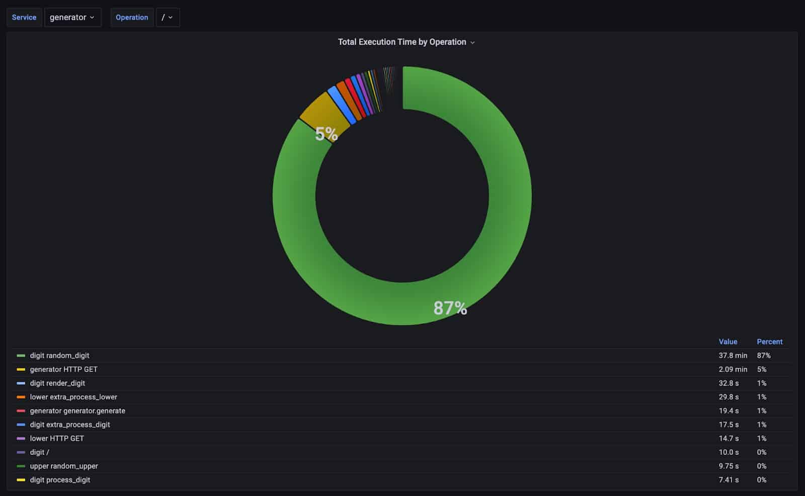
In the case of the / operation of the generator service, 87% of the time is spent in the random_digit operation of the digit service. Inspecting the code reveals why; this issue is caused by the sleep code we already identified when looking at slow traces in Jaeger.
Keep in mind that this method for computing effective time consumed by an operation only works if all downstream operations are synchronous. If your system uses asynchronous operations and those are being tracked as child spans, then the calculations would likely be incorrect, because child spans could happen outside the boundaries of their parent span.
Summary
With this lightweight OpenTelemetry demo, you can get an easy-to-deploy microservices environment with a complete OpenTelemetry observability stack running on your computer in just a few minutes.
This will help you get started with distributed tracing visualization tools like Jaeger, which are easy to use and let you dig into specific traces to troubleshoot a problem if you know what you are looking for.
With Promscale, Grafana, and SQL, you can go deeper by interrogating your trace data in any way you need. This will allow you to quickly derive new insights about your distributed systems, helping you surface and identify hard-to-find problems that you cannot find with other tools, or that would require a lot of manual work from you.
If you want to learn more about Promscale, check our website and our documentation. If you start using us, don’t forget to join the #promscale channel in our Community Slack to directly interact with the team building the product. You can also ask us any technical questions in our new Community Forum.