


Guest post from Diane Mueller, Director of Community Development at Red Hat
The adoption of CNCF technology and continuous growth in terms of projects, contributors, and end users has created one of the most active, dynamic open source ecosystems in the world. Since March 2018, when the first project, Kubernetes, officially ‘graduated’ as a CNCF project, 10 more projects have ‘Graduated,’ and a boatload of new ones (19) are currently being “Incubated” by the CNCF. It has become a daunting, almost impossible, task to navigate the complexity of the community, even as an active participant since the inception of the CNCF.
While I am eternally grateful for the filters that are baked into the CNCF Interactive Landscape enabling us to easily navigate to each of the project’s home pages, the Landscape diagram doesn’t help explain in a digestible way the burgeoning complexity of the relationships between projects, participants, and the myriad of repositories that are bursting at the seams with innovations, ideas, and almost continuous release announcements.
For the past few years at Red Hat, with the help of some open source tooling from Bitergia, I’ve been applying data visualization techniques to help us navigate the uncharted territory of project/participant relationships using network analysis. These interactive visualizations enable us to help nurture, track, and support the multiple CNCF and other open source communities that we participate in.
Leveraging this data-driven approach has become a bit of a minor obsession of mine that has helped untangle key relationships, identify new entrants (both projects and participants), and facilitate conversations with participants that often were not even aware themselves of the key roles they were playing bridging multiple communities.
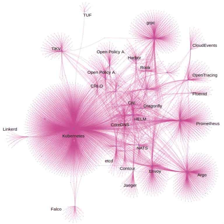
Figure #1: Year to Date Diagram of Developers’ (pink dots) Git Activity in CNCF Graduated and Incubated projects as of July 2020. Note: There is a line (pink) when that developer has contributed to a given project (blue dots). A developer has more than one line, if that developer has contributed to more than one project – these are the ‘connector’ participants.
Interactive Visualization tools help us gain a better understanding of the underlying relationships between the projects and their participants. One still needs a basic understanding of the roles each of the projects plays in the ecosystem to utilize the information accurately.
The ‘jellyfish’ diagram represents all of the participants and their relationships with both Graduated and Incubated CNCF projects. The current data set includes 13K+ participants, 250+ repositories, and just goes back to year to date as of July 2020.
There are quite a few more ancillary repositories that we have not yet incorporated into the data set as it’s a bit of a moving target, as you might imagine. For this visualization, we’ve just included the participants’ code contributions.
Each dot represents a developer that has committed at least one piece of code, logged an issue, or made a pull request to repositories. All the data points come from publicly available data from Github similar to the data that CNCF’s Devstats dashboards.
Untangling the Community Connections
If you take a look at the left side of the ‘jellyfish’ diagram above, you will notice that the Linkerd, TUF, and Falco appear a bit less entangled with the rest of the CNCF projects, but still share participants with Kubernetes. This makes it relatively easy to ‘see’ the ‘connector’ personas that are bridging these communities and (one hopes) facilitating communication. At the very least, the network analysis helps us pinpoint participants with knowledge of both projects that can potentially be tapped to help bridge any gaps.
In the denser section of the diagram, we see those projects whose participants are highly interconnected with multiple projects. This activity highlights the interdependencies of the communities and the complexity of the communication required to ensure healthy, aligned project releases, and road maps. These connectors are the ones that know how each project works, understand their idiosyncrasy, and are the glue that helps them to be aligned and facilitate the cooperation.
To illustrate, let’s dive into a specific example. When we filtered on just the Kubernetes, Operator Framework, Rook, and Helm, we see more clearly the ‘connector’ participants between the projects.
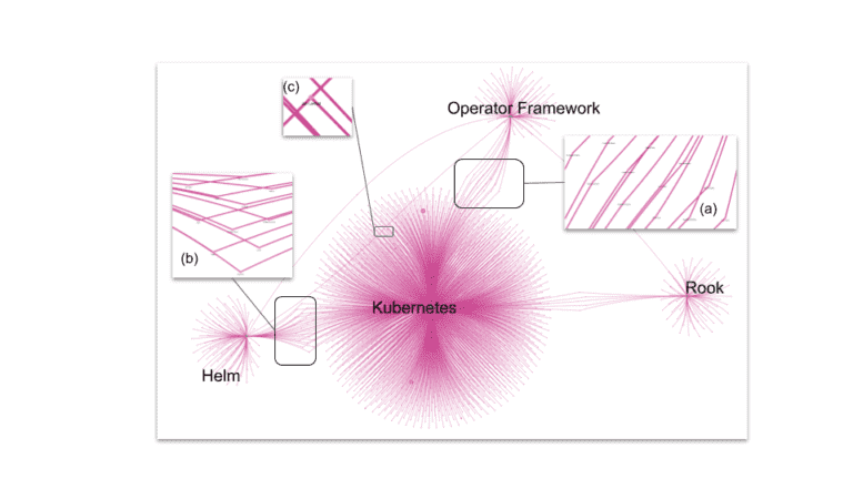
Figure #2: Kubernetes in the middle, Rook at the right side, Operator Framework at the top, and HELM at the left side of the chart.
There appears to be a healthy amount of cross-community collaboration and communication between Operator Framework and Kubernetes (a), Helm and Kubernetes (b), and also signals that there’s an opportunity to encourage more collaboration between Helm and Operator Framework (c).
Nurturing and Onboarding New Participants
With an average of 350 first time committers each month joining into the CNCF ecosystem. We can watch for their points of entry to see which projects they have engaged previously (if any) with, which ‘connectors’ that might help be able to help them get better engaged and help us ensure that they are plugged into the whole ecosystem.
Identifying Emerging Projects
An additional insight we gain from this network analysis is the ability to ‘see’ movement over time as participants migrate from one project to the next. Incorporating a time filter to the visualizations can often give us the ability to predict the emergence of new projects and initiatives within and outside of the CNCF ecosystem, often a signal to get ready for a new submission to the CNCF Technical Oversight Committee for Sandbox status.
How to Connect
If you’d like to learn more about applying network analysis to community development, check out this recent presentation “Data Driven Approach to Community Development” with OpenShift’s Diane Mueller and Bitergia’s Daniel Izquierdo
If you are involved in any of the CNCF projects or initiatives, there’s a great new CNCF Contributor Strategy SIG responsible for contributor experience, sustainability, governance, and openness guidance to help CNCF community groups and projects with their own contributor strategies for a healthy project.
If you are just looking to get started contributing to any of the CNCF projects, check out the CNCF’s Guide to Contributing to the CNCF ecosystem.
If you’d like to learn more about Red Hat OpenShift’s Open Source Community Initiatives, please visit OpenShift Commons.